Line Graph vs Area Chart: When to Use
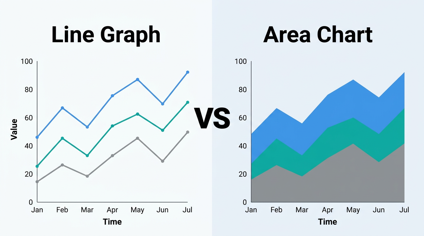
Line graphs and area charts share the same DNA — one just fills the space below the line. But that fill changes the message. Learn when the filled area adds meaning and when it creates confusion.
Read more →Discover insights, tutorials, and industry trends
Line graphs and area charts share the same DNA — one just fills the space below the line. But that fill changes the message. Learn when the filled area adds meaning and when it creates confusion.
Read more →
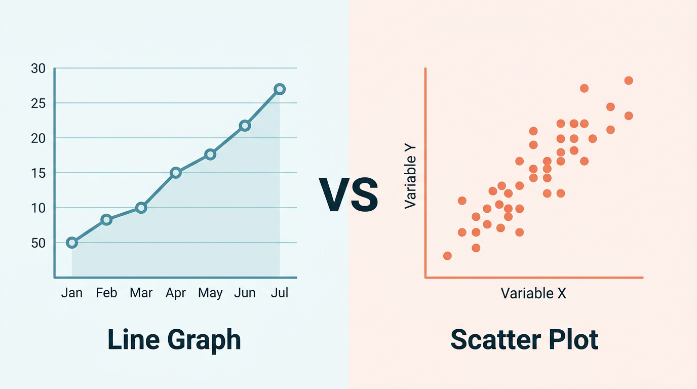
Line graphs and scatter plots look similar but answer fundamentally different questions. Learn the key differences, when each chart type excels, and how to decide in under 30 seconds — with side-by-side examples.
Read more →
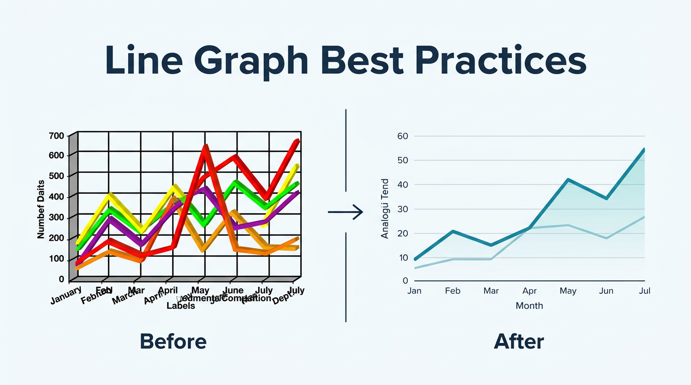
Design line graphs that communicate clearly in board decks, quarterly reports, and dashboards. Covers axis scaling, color choices, annotation, labeling, and the most common design mistakes to avoid.
Read more →
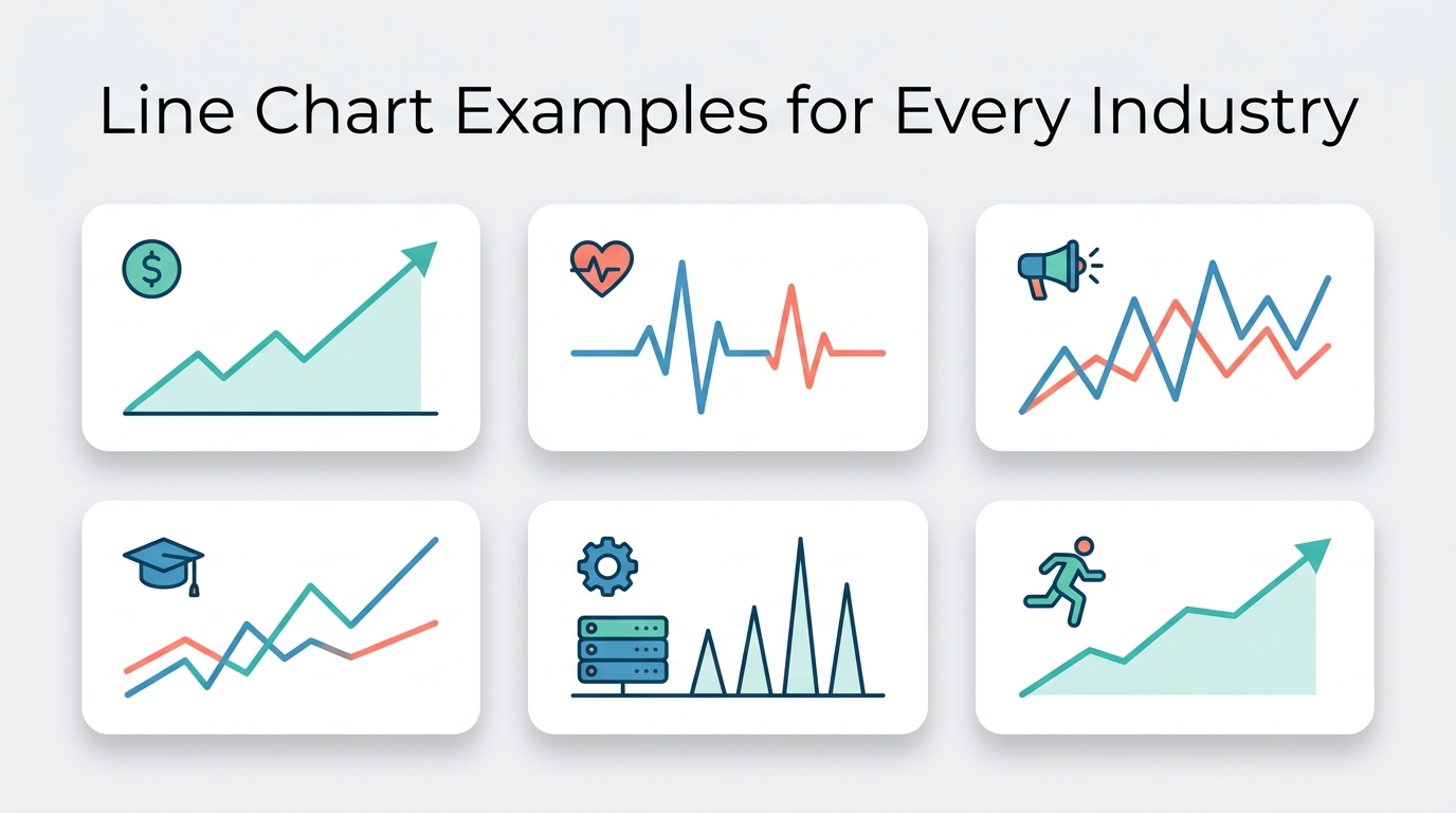
See how line charts work across finance, healthcare, marketing, education, and more. Each example includes sample data, configuration tips, and the insight it reveals — ready to recreate in Line Graph Maker.
Read more →
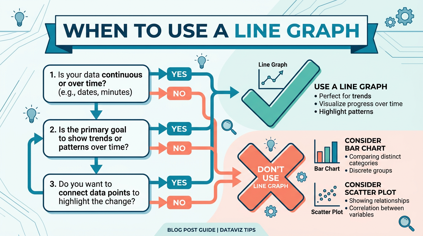
Use a line graph only when all 5 conditions hold. Skip it for rankings, composition, or correlations — with better chart picks and a 30-second checklist.
Read more →
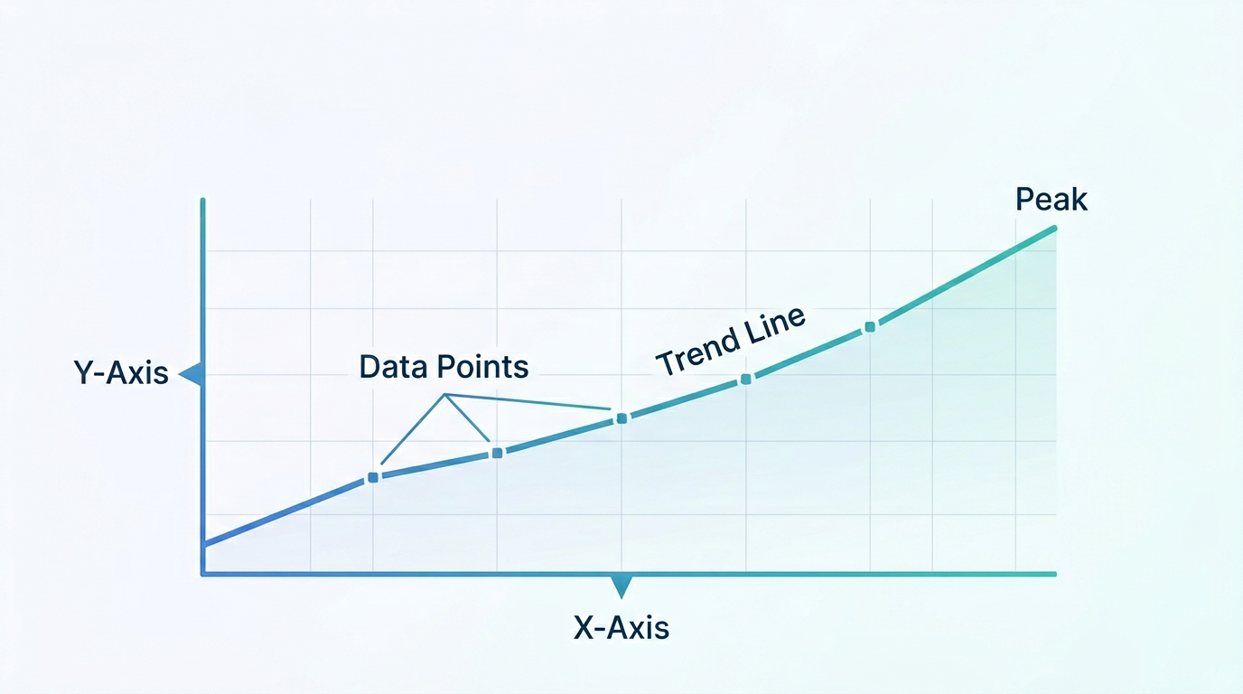
Master the art of reading line graphs in under 10 minutes. Learn to identify trends, compare series, spot outliers, and avoid the most common misreadings — with annotated examples you can practice on.
Read more →
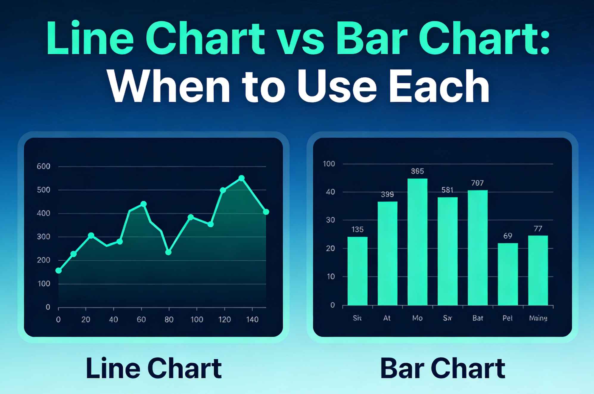
Compare line charts and bar charts with practical rules, examples, and common mistakes so you can pick the right chart for trends or categories.
Read more →