When to Use a Line Graph: 5 Rules
Choosing the wrong chart type is one of the fastest ways to confuse your audience. A line graph is the right answer more often than any other chart — but it is not always the right answer. This guide gives you a clear framework for deciding when a line graph is the best choice, and when you should reach for a bar chart, scatter plot, or something else entirely.
The Five Conditions for a Line Graph
A line graph is the strongest choice when all five of these conditions are true:
1. The X-Axis Has a Natural Order
Line graphs connect data points in sequence. That connection only makes sense when the x-axis values have a meaningful order — typically time (days, months, years) but also other continuous or ordered variables like distance, temperature, or age group.
Works: Daily revenue over the past year (ordered by date). Fails: Revenue by product category (categories have no inherent order).
2. You Care About Trends, Not Exact Values
Line graphs excel at showing direction (up, down, flat) and rate of change (steep vs. gentle slope). They are less effective when your audience needs to compare exact magnitudes between items.
Works: "Is our user growth accelerating or decelerating?" Fails: "Exactly how much more revenue did Product A generate than Product B?"
3. The Data Is Continuous or Densely Sampled
Line segments between data points imply that intermediate values exist. This assumption is valid for continuous measurements (temperature, stock price, sensor data) but misleading for sparse counts or discrete events.
Works: Hourly temperature readings across a week (smooth interpolation is reasonable). Fails: Number of office parties per quarter (connecting Q1 and Q2 with a line implies a party happened on March 15.5 — nonsensical).
4. You Have Enough Data Points
A line graph with only two data points is just a slope — it provides no pattern recognition value. You generally need at least 5–7 points per series for a line graph to reveal meaningful trends.
Works: 12 months of monthly sales figures. Fails: Before-and-after comparison of two time points (use a bar chart or a simple stat).
5. The Number of Series Is Manageable
Multi-series line graphs become unreadable when too many lines overlap. Five to seven series is the practical limit on one chart; beyond that, consider small multiples, interactive filtering, or aggregation.
Works: Comparing 4 regional sales teams over 12 months. Fails: Plotting 50 individual product sales on a single chart (spaghetti graph).
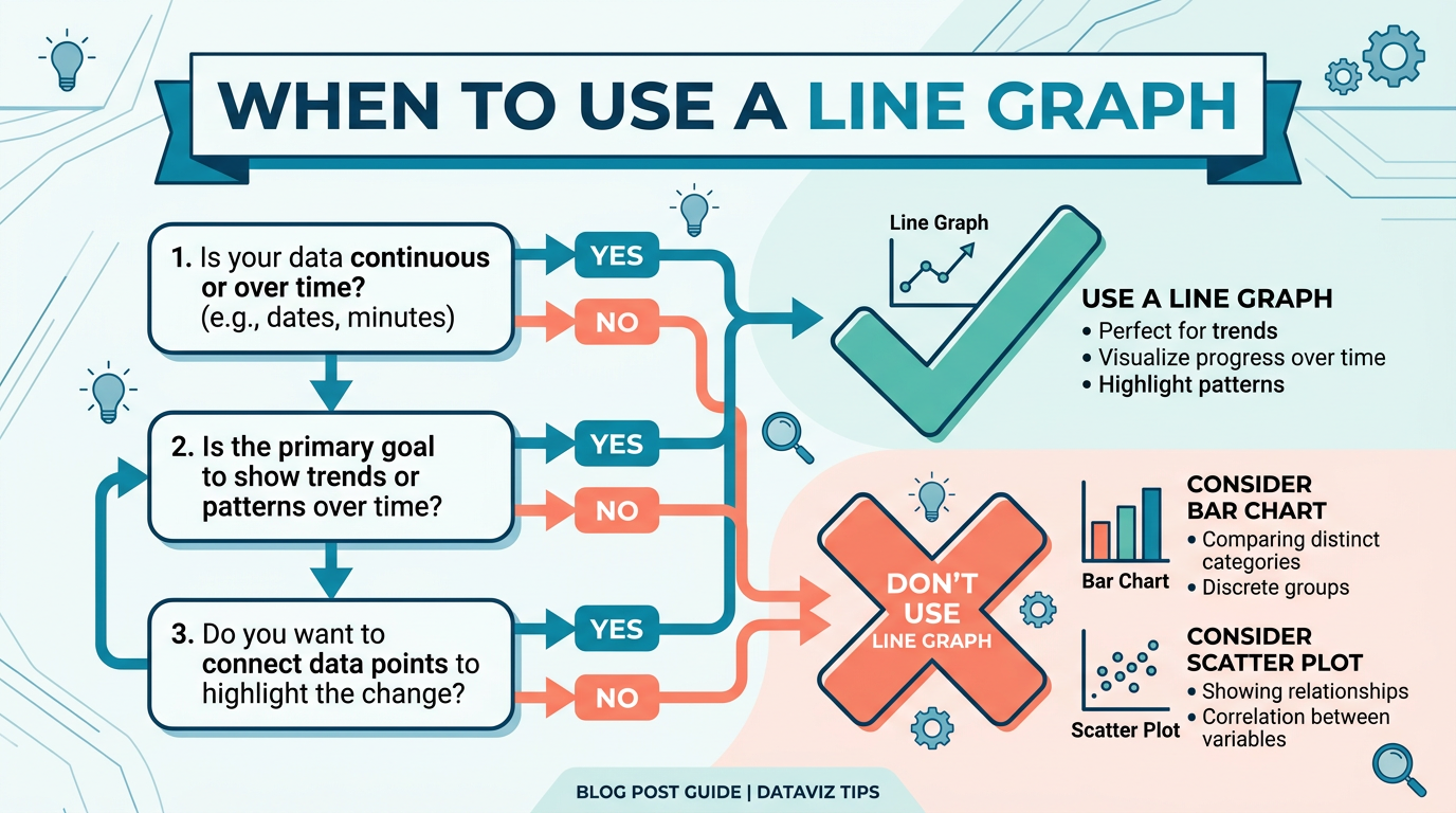
The Quick Decision Framework
When you are unsure, ask yourself these three questions in order:
Q1: Does the x-axis have a natural order?
- No → Use a bar chart (categorical) or scatter plot (two continuous variables).
- Yes → Continue.
Q2: Do you care about trend direction and change over time?
- No → Use a bar chart (magnitude comparison) or table (exact values).
- Yes → Continue.
Q3: Do you have enough data points (5+) and manageable series (≤7)?
- No → Use a bar chart (few points), sparkline (one series, tight space), or small multiples (many series).
- Yes → Use a line graph.
This decision takes under 30 seconds and handles 90% of chart selection scenarios.
When a Line Graph Is the Best Choice
Here are the most common scenarios where a line graph is clearly superior to alternatives:
Showing Trends Over Time
This is the line graph's home territory. Revenue trends, user growth, temperature patterns, stock prices — any metric tracked over a time axis.
Why line beats bar here: A bar chart with 365 daily values is a wall of rectangles. A line graph distills the same data into a readable trend with clear direction.
Comparing Multiple Trends on the Same Timeline
When you need to answer "how do these series compare over time?" — for example, organic vs. paid traffic, revenue vs. cost, or team A vs. team B performance.
Why line beats stacked area here: Stacked area obscures individual trends because each series sits on top of the previous one. Line graphs let you compare trajectories directly.
Showing Rate of Change
The slope of a line segment directly encodes the rate of change. Steep sections mean rapid change; flat sections mean stability. No other chart type communicates this as naturally.
Example: A line graph of COVID-19 cases made "flattening the curve" immediately understandable to millions of non-experts.
Detecting Cycles and Seasonality
Repeating patterns (weekly cycles, monthly seasonality, annual trends) are easy to spot in a line graph because the eye naturally follows the shape. Overlaying multiple years on the same x-axis (month 1–12) makes seasonal comparison effortless.
Forecasting and Projections
Line graphs naturally extend to include forecast data — typically shown as a dashed or lighter line continuing from the last actual data point. The visual continuity makes the transition from "what happened" to "what we expect" intuitive.
When NOT to Use a Line Graph
These are the scenarios where a different chart type is objectively better:
Comparing Discrete Categories
Use instead: Bar chart (horizontal or vertical).
If your x-axis has no meaningful order — product names, countries, departments, survey responses — a line connecting them implies a continuous relationship that does not exist.
Bad: A line graph of "Revenue by Country" connecting USA → Germany → Japan suggests a continuous transition between countries. Good: A bar chart showing the same data treats each country as an independent category. You can build one in seconds with our free bar chart maker.
Showing Part-to-Whole Composition
Use instead: Stacked bar chart, 100% stacked area, or pie chart (if ≤5 categories).
When you need to show how parts add up to a total — market share, budget allocation, time breakdown — a line graph does not communicate composition. Each line floats independently without showing how the parts relate to the whole. For part-to-whole data, a pie chart maker is the clearer choice.
Comparing Exact Magnitudes
Use instead: Bar chart or table.
When the key question is "how much bigger is A than B?" — bar charts win because our eyes compare bar lengths more accurately than line positions on a grid.
Showing Distribution or Frequency
Use instead: Histogram or box plot.
If you want to show how values are distributed (most scores cluster around 70–80, with outliers above 95), a line graph is the wrong tool. Histograms show frequency directly.
Exploring Relationships Between Two Variables
Use instead: Scatter plot.
If neither variable is "time" and you want to see if variable X correlates with variable Y, a scatter plot is correct. A line graph implies sequence — scatter plots show relationships without assumed order. Plot two variables directly in our scatter plot maker.
Very Few Data Points (2–4)
Use instead: Bar chart, number callout, or simple text.
A line graph with two points is just a slope. Three points barely form a trend. With very few data points, a bar chart or even a bold number with a percentage change is clearer and more honest.
Line Graph Variations and When to Pick Each
Not all line graphs are the same. Here is when to choose each variation:
| Variation | Best For | When to Avoid |
|---|---|---|
| Basic line | General trends, 1–5 series | Very dense data (>500 points/series) |
| Area chart | Emphasizing volume/magnitude of change | Multiple overlapping series (obscures lower ones) |
| Stacked area | Part-to-whole trends over time | When individual series trends matter more than composition |
| Step line | Discrete state changes (pricing, status) | Continuous measurements |
| Smoothed line | Highlighting trends in noisy data | When exact values matter |
| Sparkline | Compact trend indicators in tables or dashboards | When axis context is needed |
| Dual-axis line | Comparing series with different units | When it misleads (easily abused) |
| Log-scale line | Exponential data spanning orders of magnitude | Audiences unfamiliar with log scales |
Real-World Decision Examples
"I have monthly revenue for 4 product lines over 2 years."
Decision: Line graph. You have ordered time data, 24 points per series, 4 manageable series, and you care about trends. This is textbook line graph territory.
"I need to show customer satisfaction scores for 12 departments."
Decision: Bar chart. Departments are unordered categories. A horizontal bar chart sorted by score makes comparison easy.
"I want to show how our marketing budget is split across channels."
Decision: Pie chart (if ≤5 channels) or stacked bar. This is a part-to-whole question — how each channel contributes to the total.
"I have daily stock prices for the past 5 years."
Decision: Line graph on a standard scale, or log-scale line if the price grew exponentially. 1,250+ data points mean you should hide individual markers and let the line shape do the work.
"I want to see if study hours correlate with exam scores."
Decision: Scatter plot. Two continuous variables with no time component. Each student is an independent observation — no sequence to connect.
"I have before-and-after measurements for 3 metrics."
Decision: Bar chart or grouped bar chart. Two data points per series is not enough for a meaningful line graph.
Try It Yourself
The fastest way to learn when a line graph works (and when it does not) is to try both and compare. With Line Graph Maker, you can:
- Paste your data and see the line graph instantly.
- Switch between chart types (line, area, step, bar) to compare which communicates your data best.
- Add or remove series to find the right level of complexity.
- Experiment with scales (linear vs. log) and axis ranges.
- Export the chart that works best for your audience.
When the line graph is right, you will know — the trend will jump off the screen. When it is wrong, the chart will feel cluttered or confusing. Trust that instinct.
Frequently Asked Questions
Can I use a line graph for survey data?
Only if the survey questions have a natural order (e.g., Likert scale over time, or test scores across sequential assessments). If you are comparing responses across unordered categories ("How satisfied are you with X, Y, Z?"), use a bar chart.
Is a line graph or bar chart better for presentations?
It depends on the message. Use a line graph when you want the audience to see a trend or trajectory ("we are growing"). Use a bar chart when you want them to compare magnitudes ("Team A outperformed Team B by 30%"). For maximum impact, choose the chart that delivers your key message in one glance.
When should I use an area chart instead of a line chart?
Use an area chart when you want to emphasize the volume or magnitude of change, not just the direction. The filled area below the line adds visual weight. Stacked area charts are useful when you want to show how the total (and its composition) changes over time. Avoid area charts when multiple series overlap — the bottom series gets obscured.
Can a line graph have a non-time x-axis?
Yes. The x-axis can be any ordered, continuous variable: altitude, temperature, age, concentration level, distance from a point. The key requirement is that connecting adjacent points with a line makes physical or logical sense.
How do I decide between a line graph and a scatter plot?
Line graph: when your data points have a natural sequence (usually time) and you want to show the path from one point to the next. Scatter plot: when each point is an independent observation, there is no sequence, and you are looking for correlation or clustering between two variables.
What about pie charts vs line graphs?
They answer different questions. Pie charts answer "what fraction of the whole does each category represent?" Line graphs answer "how does a value change over time?" They are almost never interchangeable. If someone asks you to choose between a pie chart and a line graph, you are probably asking the wrong question — figure out whether the insight is about composition or trend first.
Should I use a dual-axis line graph?
Rarely. Dual-axis charts are easily misread and can imply false correlations by manipulating axis scales. If you must compare two metrics with different units, consider: (1) normalizing both to percentage change, (2) using two separate charts stacked vertically, or (3) only using dual axes with clear labeling and an honest scale.
How many data points are too many for a line graph?
There is no hard upper limit, but practical considerations apply. Beyond 500 points per series, individual points blur together — which is fine for showing trends but prevents reading specific values. For very large datasets (10,000+), use data aggregation (daily averages instead of per-minute readings) or enable interactive zooming.
Share this article
Help others discover this content
Published on April 21, 2026
Last updated on July 21, 2026