Line Graph vs Scatter Plot: How to Choose the Right Chart
Line graphs and scatter plots both place data points on an x-y grid. At a glance, they can look almost identical — especially when a scatter plot's points happen to follow a clear pattern. But they answer fundamentally different questions, and choosing the wrong one will mislead your audience.
This guide explains exactly when to use each, with side-by-side examples that make the difference concrete.
The Core Difference
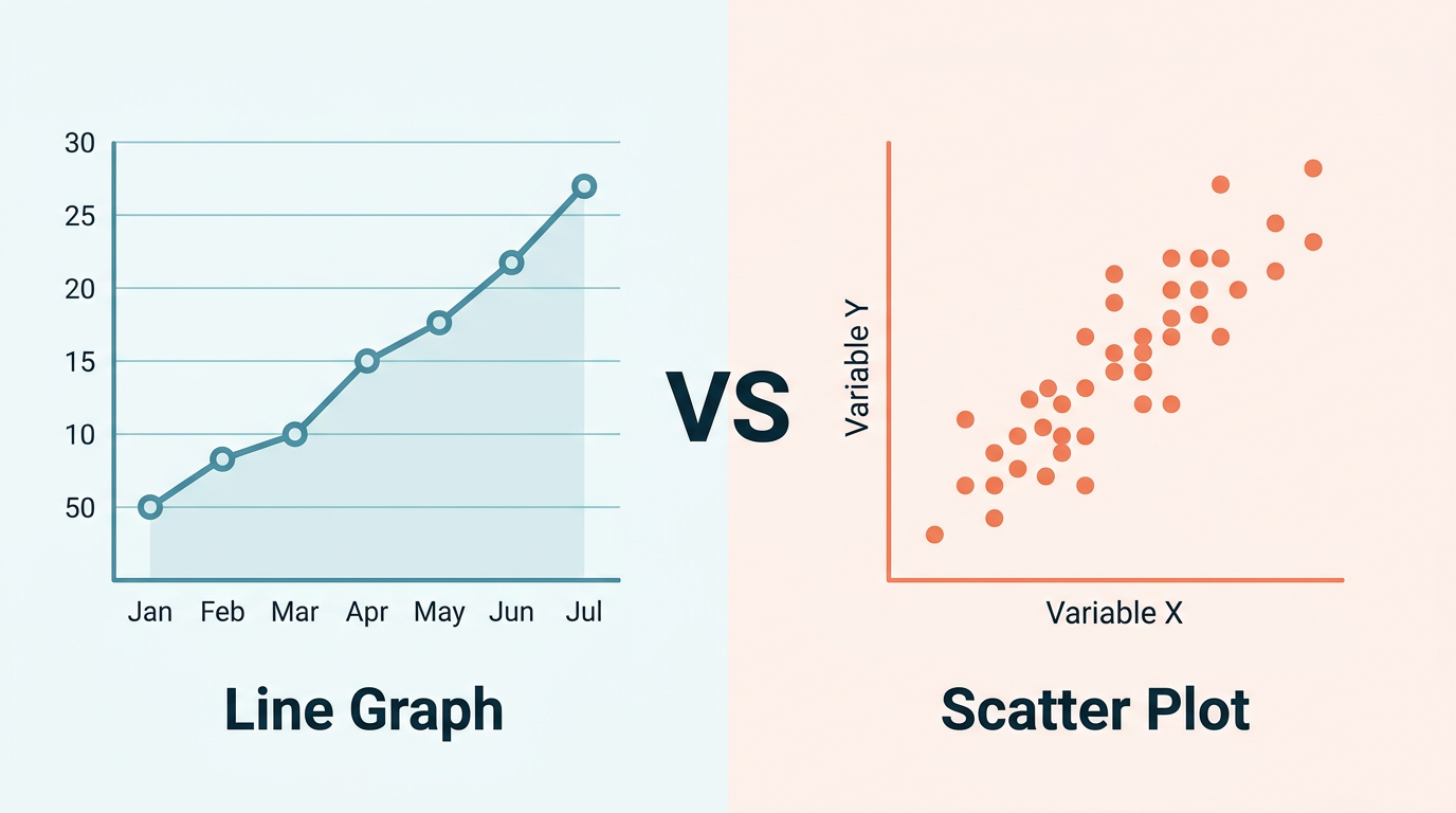
A line graph connects points in sequence. The line between points implies a path — what happened between measurement A and measurement B. Order matters. The x-axis has a natural progression (usually time).
A scatter plot shows independent observations. Each dot is a standalone data point. There is no implied order, no path between points. The chart shows the relationship between two variables, not a journey through them.
| Aspect | Line Graph | Scatter Plot |
|---|---|---|
| X-axis | Ordered (time, sequence) | Any continuous variable |
| Connection | Lines connect adjacent points | No connections |
| Question it answers | "How does Y change over X?" | "Is there a relationship between X and Y?" |
| Each point represents | A measurement at a specific position in the sequence | An independent observation |
| Typical use | Trends over time | Correlation analysis |
When to Use a Line Graph
Use a line graph when:
- The x-axis has a natural order — time, sequence number, distance along a route.
- You care about the trajectory — direction, rate of change, cycles.
- Intermediate values are meaningful — the line between January and March implies that February existed with some value between the two.
- The data tells a story in order — "first this happened, then this, then this."
Classic examples:
- Monthly revenue over a year.
- Daily temperature across a week.
- Stock price history.
- User growth since product launch.
- A patient's heart rate during surgery.
When to Use a Scatter Plot
Use a scatter plot when:
- Each observation is independent — no inherent order between data points.
- You want to find correlation — does variable X predict variable Y?
- Connecting points would be meaningless — there is no logical "path" from one point to the next.
- You have many observations — scatter plots shine with 50+ data points where patterns emerge from density. Try our free scatter plot maker to plot your own data with a built-in regression line.
Classic examples:
- Height vs. weight for 200 people.
- Study hours vs. exam score.
- Marketing spend vs. revenue across campaigns.
- House size vs. sale price.
- GDP per capita vs. life expectancy across countries.
Side-by-Side Comparison
Example 1: Temperature Data
Scenario A — Temperature over 7 days: You measure temperature every day for a week: Mon 20°C, Tue 22°C, Wed 19°C, Thu 24°C, Fri 23°C, Sat 21°C, Sun 25°C.
Correct chart: Line graph. The data has a time sequence. The line connecting Monday to Tuesday implies the temperature transitioned between those values — which it did. You care about the trend: "Is it getting warmer this week?"
Scenario B — Temperature vs. altitude at 50 weather stations: You collect the temperature and altitude of 50 weather stations scattered across a mountain range.
Correct chart: Scatter plot. There is no sequence connecting station 1 to station 2. Each station is an independent observation. You want to see the relationship: "Does altitude predict temperature?" The scatter plot reveals a downward pattern — higher altitude, lower temperature.
Example 2: Sales Data
Scenario A — Monthly sales for 2024: Jan $50K, Feb $55K, Mar $62K ... Dec $120K.
Correct chart: Line graph. Time-ordered, trend-focused. The story is growth trajectory.
Scenario B — Ad spend vs. sales for 100 marketing campaigns: Each campaign has a different ad budget and a resulting sales figure. Some spent $1K and got $5K in sales; others spent $50K and got $200K.
Correct chart: Scatter plot. Each campaign is independent. You want to see the correlation: "Does more spending lead to more sales?" A trend line through the scatter reveals the ROI relationship.
Example 3: Student Data
Scenario A — A student's test scores across 10 exams: Exam 1: 72, Exam 2: 75, Exam 3: 68, ... Exam 10: 88.
Correct chart: Line graph. Sequential exams, showing learning progression.
Scenario B — Class of 100 students: hours studied vs. final grade: Student A: 10 hours, 78%. Student B: 25 hours, 92%. Student C: 5 hours, 55%.
Correct chart: Scatter plot. Each student is independent. You want to know: "Does studying more lead to higher grades?"
The Hybrid: Connected Scatter Plot
Sometimes you need both — independence and sequence. A connected scatter plot shows each point as an independent observation and draws lines connecting them in order.
When to use it:
- Time series where both X and Y change (not a traditional time-on-x-axis chart).
- Plotting latitude vs. longitude of a moving object (GPS track).
- Showing how two related metrics evolve together over time.
Example: Plotting a country's GDP (x-axis) against life expectancy (y-axis) over 50 years. Each year is a point, connected in chronological order. You see both the relationship (richer → longer life) and the trajectory (how the country moved over time).
Common Mistakes
Mistake 1: Using a Line Graph When Points Are Independent
If your x-axis is "Country" and each country has a GDP value, connecting them with a line implies a transition from USA to Germany to Japan — which is nonsensical. Use a scatter plot (if comparing two variables) or a bar chart (if showing one variable per category).
Mistake 2: Using a Scatter Plot When Order Matters
If your data has a meaningful sequence (timestamps, trial numbers), a scatter plot hides the narrative. The reader cannot tell which point came first. Use a line graph so the temporal story is visible.
Mistake 3: Adding a Trend Line to a Line Graph
A linear regression trend line makes sense on a scatter plot (showing the best-fit relationship between X and Y). On a line graph, the "line" already shows the trend — adding a regression line on top creates visual confusion.
Exception: A rolling average line overlaid on a noisy time series is useful, but that is different from a regression trend line.
Mistake 4: Forcing Scatter Data Into a Line Graph
When scatter data happens to show a pattern, the temptation is to connect the dots. Resist it. If the points are independent observations, the connections lie about relationships that do not exist between adjacent points.
Decision Cheat Sheet
Ask these two questions:
Q1: Do your data points have a natural order?
- Yes (time, sequence, distance) → Lean toward line graph.
- No (independent observations) → Lean toward scatter plot.
Q2: What question are you answering?
- "How does Y change as X progresses?" → Line graph.
- "Is there a relationship between X and Y?" → Scatter plot.
If the answer to Q1 is "yes" AND Q2 is "relationship," consider a connected scatter plot or dual-panel approach (line graph + scatter plot of the same data).
Try Both and Compare
With Line Graph Maker, you can visualize your data as a line graph and see immediately whether the connected line tells a meaningful story — or whether disconnected points (scatter) would be more honest.
- Paste your data.
- Generate the line chart.
- Ask yourself: "Does connecting these points make logical sense?"
- If yes, you have the right chart. If the connections feel forced, switch to a scatter plot.
The tool exports both chart types as PNG or SVG, so you can try both and include whichever communicates your insight more clearly.
Frequently Asked Questions
Can I add a trend line to a scatter plot?
Yes — this is one of the most useful features of a scatter plot. A linear, polynomial, or logarithmic trend line reveals the mathematical relationship between the two variables. Include the R² value to show how well the trend line fits the data.
What if my data has both time order AND I want to show correlation?
Use two charts side by side: a line graph showing each variable over time, and a scatter plot showing their relationship. Or use a connected scatter plot where the connection follows time order but the axes show the two variables of interest.
How many points does a scatter plot need?
At minimum, 20–30 points to see a meaningful pattern. Scatter plots get better with more data — 100+ points create clear density patterns. With fewer than 15 points, both scatter plots and line graphs are fragile; consider a simple table instead.
Can a scatter plot have multiple series?
Yes. Color-code each series (e.g., blue dots for Group A, orange for Group B) to compare relationships across groups. This is a powerful technique for seeing whether different populations follow the same or different patterns.
Is a bubble chart a type of scatter plot?
Yes. A bubble chart is a scatter plot where a third variable is encoded as the size of each dot. It adds another dimension of information but can become cluttered with many data points.
When should I use a bar chart instead of either?
When your x-axis has discrete, unordered categories (product names, countries, departments) and you want to compare magnitudes. Bar charts are not line graphs (no trend implication) and not scatter plots (no two-variable relationship). They compare values across categories.
Can I use a scatter plot for time series data?
Technically yes, but you lose the sequential narrative. A scatter plot of (timestamp, value) pairs looks like a line graph without the lines — which removes the main benefit of seeing the trajectory. Stick with a line graph for time series unless you specifically want to hide the order (rare).
Share this article
Help others discover this content
Published on April 21, 2026
Last updated on May 29, 2026