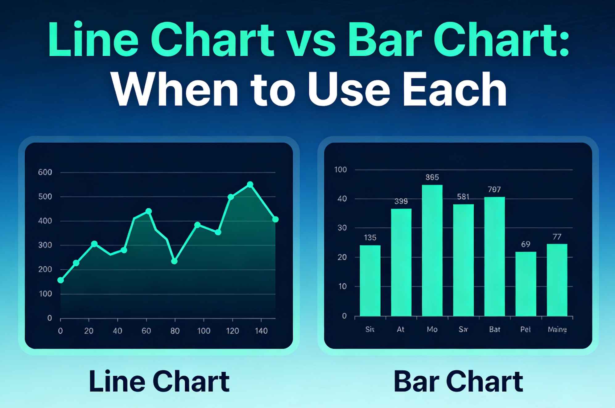
Line Chart vs Bar Chart: When to Use Each
Struggling to choose the right chart for your data?
You are not alone.
Choosing between a line chart and a bar chart can make or break your presentation. Pick the wrong one, and your audience is confused. Pick the right one, and your insights become instantly clear.
In this definitive guide, I’ll show you exactly when to use a line chart versus a bar chart.
We will break down the exact scenarios, the psychology behind why they work, and the fatal mistakes most people make.
By the end of this post, you’ll master data visualization best practices and craft charts that your readers actually love.
Let's dive right in.
Chapter 1: The Basics of Line Charts
What is a line chart?
A line chart is a powerful visualization tool that displays information as a series of data points connected by straight line segments. This creates a continuous movement, usually from left to right.
But when should you actually use one?
Line charts excel at one specific thing: showing continuous change over time.
Here are the proven scenarios to deploy a line chart:
1. Tracking Trends Over Time
This is the ultimate use case for line charts. Whether it's zooming in on website traffic growth, analyzing daily temperatures, or monitoring stock market changes, line charts show the journey clearly. The continuous line helps our brains instantly process the direction and pace of change.
2. Highlighting Peaks, Dips, and Patterns
Line charts make it incredibly easy to spot significant shifts, outliers, or seasonal anomalies in your data. If your sales always spike in November and drop in February, a line chart will make this pattern glaringly obvious.
3. Comparing Multiple Continuous Data Sets
Different colored lines can be overlaid on the same axis to compare patterns for multiple variables. Want to compare the monthly revenue of Product A vs. Product B over the last three years? A multiple-line chart is your best option.
4. Forecasting Future Results
Looking into the future? Extended forecast lines help predict upcoming values based on historical trends. This is crucial for business planning and financial modeling.
If you are ready to build your own, our completely free line graph maker lets you turn your raw data into a beautiful, presentation-ready line chart in seconds.
Chapter 2: The Advanced Variations of Line Charts
Not all line charts are created equal. Once you master the basic line chart, you can level up your data storytelling by using specific variations.
The Multiple-Line Graph
This is perfect when you need to compare trends for two or more related aspects on the same scale. The key here is clarity. Pro Tip: Limit yourself to 4 or 5 lines maximum. Any more than that, and you create a messy "spaghetti chart" that is impossible to read.
The Step Line Chart
Instead of straight slopes connecting points, this connects data points with horizontal and vertical lines (like stairs). When to use it: Use this when highlighting irregularities or when changes occur at specific, discrete intervals (like changes in tax rates or postage stamp prices over time).
The Smoothed Line Chart (Spline Chart)
This connects data points with smoothed curves rather than jagged angles. When to use it: Use a smoothed line when you want to emphasize the overall pattern and gradual changes, rather than precise, point-to-point fluctuations.
The Sparkline
A sparkline is a tiny, simplified line chart typically embedded directly within text or a table. It has no axes or labels. When to use it: Use sparklines in dashboards to provide a quick, intuitive visual of a trend without taking up valuable screen real estate.
If you don't want to wrestle with Excel to create these, try using an intuitive online line chart generator designed specifically to make these variations effortlessly.
Chapter 3: The Fatal Mistakes People Make with Line Charts
Even data scientists mess up line charts. Here are the most common pitfalls you need to avoid:
- Using Line Charts for Discrete Data: This is a cardinal sin. If you are comparing "Apples," "Oranges," and "Bananas," connecting them with a line implies a continuous relationship that doesn't exist. Never use a line chart for non-continuous categories.
- Inconsistent Scaling: Always employ consistent scaling on your X and Y axes. Changing the scale halfway through distorts the data and misleads your audience.
- Overwhelming Clutter: Gridlines, massive legends, and giant data labels create visual noise. Keep it clean. Let the trend line be the star of the show.
Chapter 4: The Basics of Bar Charts
Let's shift gears. What exactly is a bar chart?
A bar chart utilizes rectangular bars to represent data values. The length or height of each bar is proportional to the value it signifies.
It sounds basic. But it is incredibly effective. Our eyes are exceptionally good at comparing the lengths of objects placed side-by-side.
Here is exactly when to use a bar chart for maximum impact:
1. Comparing Different Categories
Doing a side-by-side comparison? Bar charts are ideally suited for showing comparisons between various categories or groups of data (e.g., sales figures for different phone models). The separate bars emphasize that each category is its own distinct entity.
2. Showing Rankings
Need to display items in a ranked order? Bar charts are your best friend here. If you want to show the top 10 highest-grossing movies of the year, a sorted bar chart makes the hierarchy instantly clear.
3. Displaying Frequency Distributions
They are excellent for illustrating how frequently specific values occur within a dataset. For example, showing how many customers fall into different age brackets (18-24, 25-34, etc.).
4. Emphasizing Individual Values
Line charts emphasize the trend. Bar charts emphasize the individual value. They make it dead simple to identify the absolute highest or lowest values within any dataset at a glance. When that is your goal, our free bar chart maker turns a CSV into a clean, sorted bar chart in seconds.
Chapter 5: The Advanced Variations of Bar Charts
Just like line charts, bar charts have powerful variations. Knowing when to use each will make your reports significantly more professional.
Vertical Bar Charts (Column Charts)
The classic. These are highly effective for making nominal comparisons at a single point in time. Pro Tip: Use vertical bars when your category labels are short (like "Jan," "Feb," "Mar" or "Yes," "No").
Horizontal Bar Charts
In this variation, the categorical variable is on the vertical axis, and the bars grow left to right. When to use it: This is the absolute best choice when your category labels are long. It prevents text overlap and keeps your chart legible. It's also excellent for showing rankings (Top 10 lists).
Clustered (Grouped) Bar Charts
These group two or more bars side-by-side within each category. When to use it: Use this when comparing multiple subcategories across the same set of categories. (e.g., Comparing Q1, Q2, Q3, Q4 sales, grouped by North America vs. Europe).
Stacked Bar Charts
Here, the bars are divided into segments that sum up to a whole. When to use it: Use stacked bars to compare total values while also understanding the breakdown of individual components (parts-to-whole view).
Chapter 6: The Fatal Mistakes People Make with Bar Charts
Don't let these simple errors ruin your hard work:
- Not Starting the Y-Axis at Zero: This is the biggest mistake in data visualization. If you truncate the Y-axis (start it at 50 instead of 0), you exaggerate the differences between the bars. It is fundamentally misleading. Always start bar charts at zero.
- Inconsistent Bar Widths: The width of the bars means nothing in a standard bar chart, so keep them uniform. Inconsistent widths confuse the viewer's interpretation of the data's volume.
- Using Too Many Categories: A column chart with 30 skinny vertical bars is unreadable. If you have that many categories, switch to a horizontal bar chart, or reconsider how you are grouping the data.
Chapter 7: The Step-by-Step Decision Framework
Now you know the strengths, weaknesses, and advanced variations of both charts.
But how do you actually choose between them when staring at a blank spreadsheet?
Follow this simple 3-step checklist before building your next report:
Step 1: Look at Your X-Axis (The Horizontal Axis)
What type of data are you plotting on the bottom axis?
- Is it a continuous interval of time (days, months, years)? Go with a Line Chart.
- Are they distinct, separate categories (countries, products, departments)? Go with a Bar Chart.
Step 2: Define Your Core Message
What is the primary story you want the audience to walk away with?
- Are you trying to show how something evolved or progressed? Evolution = Line Chart.
- Are you comparing the absolute sizes or magnitudes of different items? Size Comparison = Bar Chart.
Step 3: Check Your Data Density
How many data points do you have?
- Do you have dozens or hundreds of data points over time? A Line Chart handles high-density continuous data perfectly. Want to see how easy it is to plot hundreds of data points? Head over to our line graph maker and paste your data right in.
- Do you only have two or three periods to compare (e.g., 2023 vs 2024)? A Line chart might look awkward. A Vertical Bar Chart (Column chart) often works better to show the distinct jump from Year 1 to Year 2.
Chapter 8: Real-World Case Studies
Let's look at how applying these rules gets real-world results.
Case Study 1: The Regional Sales Disaster
Recently, a SaaS client was presenting an annual sales report to their board. They used a massive line chart to show the total sales of 12 distinct regional offices.
The problem? The regions weren't connected by time. The line connected "North America," "Europe," "Asia," and "South America."
The line chart implied a continuous flow between these regions, which makes zero logical sense. Are sales "traveling" from Europe to Asia? No.
It was extremely confusing.
The Fix: We switched it to a horizontal bar chart ordered from highest sales to lowest.
The Result: Readability skyrocketed. The executive team immediately saw which regions were underperforming. No squinting. No confusion. Just clear, actionable insights.
Case Study 2: The Website Traffic Mystery
An e-commerce brand was trying to figure out why their conversion rate was dropping. They plotted their daily conversion rate for the last 90 days using a vertical bar chart (column chart).
The problem? With 90 distinct bars squeezed together, the chart looked like a solid block of ink. It was impossible to see the shape of the data. They couldn't tell if the drop was sudden or gradual.
The Fix: We converted the 90 bars into a single smoothed line chart. We also overlaid a second line showing their daily ad spend.
The Result: The trend became instantly visible. They realized the conversion rate didn't just drop—it plummeted on the exact day they launched a new checkout page design. The continuous line revealed a pattern that 90 individual bars had completely hidden.
Chapter 9: When to Combine Them (The Combo Chart)
Is it ever okay to use both at the same time? Yes.
Welcome to the Bar and Line Combo Chart.
These charts combine a bar chart with a line chart, often sharing a horizontal axis but using different vertical axis scales for each chart type.
When to use it: You should use a combo chart when you need to display two different, but related, metrics with vastly different scales.
For example: You want to show Monthly Total Revenue (in millions of dollars) and the Monthly Profit Margin (a percentage).
You plot the Revenue as vertical bars (using the left Y-axis for dollars), and you plot the Profit Margin as a line (using the right Y-axis for percentages).
This allows you to see if your profit margin trends up or down as your revenue grows, all in one space-saving visualization.
Conclusion
There you have it: a complete, in-depth guide to choosing between a line chart and a bar chart.
Remember: the goal of data visualization isn't to look fancy or to use the most complex chart available in your software. The goal is to make complex data instantly understandable.
A simple chart that communicates clearly will always beat a complex chart that confuses your audience.
If you are ready to put this into practice and create a stunning visualization right now, try out our free line graph maker. You don't even need to create an account.
Now I want to hear from you:
Which chart type are you going to use for your next report?
Are you going to track trends with a line chart? Or compare categories with a bar chart?
Either way, let me know by leaving a comment below right now.
Share this article
Help others discover this content
Published on March 14, 2026
Last updated on May 29, 2026