How to Read a Line Graph: Beginner's Guide
Line graphs are the most common chart type you will encounter — in news articles, school assignments, business dashboards, and scientific papers. Yet surprisingly few people have been formally taught how to read one properly.
This guide gives you a repeatable, step-by-step process for extracting accurate insights from any line graph. By the end, you will be able to read a line graph the way a data analyst does: quickly, accurately, and without falling for the visual traps that mislead casual readers.
What Is a Line Graph?
A line graph (also called a line chart) plots data points on a two-dimensional grid and connects them with straight or curved line segments. The horizontal axis (x-axis) typically represents time or an ordered category, while the vertical axis (y-axis) represents a measured quantity.
The primary purpose of a line graph is to show how a quantity changes over an ordered sequence — usually time.
Anatomy of a Line Graph
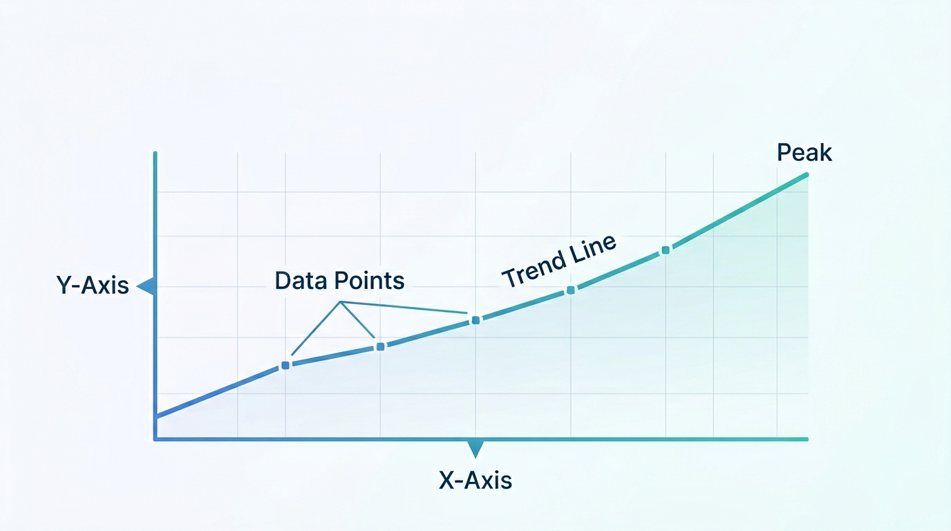
Before you can read a graph, you need to name its parts:
| Component | What It Does |
|---|---|
| X-axis (horizontal) | Shows the independent variable — usually time (days, months, years) or another ordered category |
| Y-axis (vertical) | Shows the dependent variable — the quantity being measured (revenue, temperature, population) |
| Axis labels | Tell you what each axis measures and the unit of measurement |
| Axis scale | The range and intervals on each axis (e.g., 0 to 100 in steps of 20) |
| Data points | Individual measurements plotted on the grid |
| Line segments | Connections between data points that reveal the trend |
| Title | Describes what the graph shows |
| Legend | Identifies each line when multiple series are present |
| Grid lines | Background lines that help you estimate values |
Master these components, and you will never feel lost looking at a line graph again.
Step-by-Step: How to Read Any Line Graph
Follow these five steps in order. They work for every line graph, from a simple single-line school assignment to a complex multi-series financial dashboard.
Step 1: Read the Title and Axes First
This is the most commonly skipped step — and the most important.
- Read the title. It tells you what is being measured and often why.
- Read the x-axis label and scale. What is the time range or category sequence? What is the interval between tick marks?
- Read the y-axis label and scale. What unit is being measured? Where does the scale start — at zero, or is it truncated?
Why this matters: A graph titled "Revenue Growth" where the y-axis starts at $950,000 instead of $0 will make a $50,000 increase look dramatic. Without checking the axis, you would misread the magnitude of change.
Step 2: Identify the Overall Trend
Once you know what you are looking at, step back and look at the big picture:
- Upward trend: The line generally moves from lower-left to upper-right. The measured quantity is increasing.
- Downward trend: The line moves from upper-left to lower-right. The quantity is decreasing.
- Flat trend: The line is roughly horizontal. The quantity is stable.
- Cyclical pattern: The line rises and falls in a repeating pattern (common with seasonal data like retail sales or temperature).
- No clear trend: The line moves erratically without a dominant direction.
Do not try to interpret every wiggle at this stage. Just get the headline: is it going up, down, or sideways?
Step 3: Look for Key Points
Now zoom in and identify the moments that matter:
- Peaks (highest points): When did the quantity reach its maximum? How high was it?
- Troughs (lowest points): When did it hit rock bottom?
- Turning points: Where does the trend change direction? An upward trend becoming flat, or a flat trend starting to climb.
- Sharp changes: Any sudden spikes or drops stand out visually. These often correspond to real-world events (a product launch, a policy change, a crisis).
- Plateaus: Extended flat sections where the quantity remains stable despite time passing.
Step 4: Compare Series (If Multiple Lines Exist)
Many line graphs show two or more data series on the same axes. When they do:
- Which line is higher overall? This tells you which series has greater magnitude.
- Do the lines converge or diverge? Converging lines mean the gap is closing; diverging lines mean it is widening.
- Do the lines cross? A crossover point is usually significant — it means one series overtook the other.
- Do they move in the same direction? Parallel movement suggests correlation; opposite movement suggests an inverse relationship.
- Check the legend. Make sure you know which line represents which series. Color-blind readers should check for patterns (dashed, dotted) if colors are hard to distinguish.
Step 5: Read Specific Values
Finally, use the grid lines or your best estimation to read precise values:
- Pick a point on the x-axis (a specific date or category).
- Move vertically up to where the line is at that point.
- Move horizontally to the y-axis to read the value.
If the graph has interactive tooltips (common in digital tools like Line Graph Maker), hover over the point for the exact value. For printed graphs, accept that you are estimating — and round to the nearest grid line.
Common Mistakes When Reading Line Graphs
Even experienced readers make these errors. Being aware of them is half the battle.
Mistake 1: Ignoring the Y-Axis Scale
A truncated y-axis (one that does not start at zero) exaggerates small changes. A graph showing temperatures from 98°F to 102°F looks like a wildly oscillating fever; zoomed out to 0°F – 200°F, the line is nearly flat.
How to avoid it: Always check where the y-axis starts. Ask yourself: "If this axis started at zero, would the change still look significant?"
Mistake 2: Assuming Causation from Correlation
Two lines moving in the same direction on the same chart does not mean one causes the other. Ice cream sales and drowning rates both rise in summer — not because ice cream causes drowning, but because a third variable (warm weather) drives both.
How to avoid it: Treat co-movement as a hypothesis, not a conclusion. Look for a plausible causal mechanism before claiming one variable drives another. When you want to test whether two variables are actually related, plot them directly with a scatter plot maker.
Mistake 3: Overinterpreting Noise
Short-term fluctuations in noisy data are often just random variation, not meaningful signals. A single day where website traffic drops 10% is not a crisis; a three-month downward trend is.
How to avoid it: Look for the trend, not individual data points. If a single point contradicts the overall pattern, it is more likely noise than signal unless you can identify a specific cause.
Mistake 4: Misreading Dual Y-Axes
Some graphs use two y-axes (one on the left, one on the right) to plot series with very different scales. This can be misleading because the visual relationship between the lines depends entirely on how the axes are scaled.
How to avoid it: Read both axis labels carefully. Understand that the two series are not on the same scale, so visual proximity does not imply similar magnitude.
Mistake 5: Confusing Levels with Rates of Change
A line that is still rising but less steeply means the quantity is growing, but the growth rate is slowing. Many readers see a flattening slope and mistakenly report "the quantity stopped growing" when it is still increasing — just more slowly.
How to avoid it: Distinguish between the value (the height of the line) and the rate of change (the steepness of the slope). A line can be high and flat (high value, zero growth) or low and steep (low value, fast growth).
Practice: Reading a Real Line Graph
Let us put these steps into practice. Imagine a line graph with the title "Monthly Website Visitors (2024)" showing:
- X-axis: Jan through Dec
- Y-axis: 0 to 50,000 visitors
- Two lines: "Organic Search" (blue) and "Paid Ads" (orange)
Applying our five steps:
- Title and axes: We are looking at monthly website visitors for a full year. Y-axis starts at zero — good, no exaggeration.
- Overall trend: Organic Search rises steadily from ~5,000 in January to ~40,000 in December. Paid Ads is flat at ~10,000 until July, then drops to ~5,000.
- Key points: Organic has a sharp jump in March (likely a content push or algorithm update). Paid has a peak in June, then declines.
- Comparison: Organic overtakes Paid in April (crossover point). By December, Organic is 8x Paid.
- Specific values: In October, Organic ≈ 35,000, Paid ≈ 7,000.
Insight: The company shifted from paid acquisition to organic growth, and organic is working — it is growing exponentially while paid spend is being cut.
Line Graphs vs Other Chart Types
Understanding when a line graph is the right chart to read helps you interpret it correctly:
| Scenario | Best Chart | Why |
|---|---|---|
| Trends over time | Line graph | Connects ordered points to show direction and rate of change |
| Comparing categories | Bar chart | Discrete bars make magnitude comparison easy |
| Part-to-whole | Pie or stacked area chart | Shows proportions and composition |
| Relationship between two variables | Scatter plot | Each dot is independent; no implied order |
| Distribution of values | Histogram | Shows frequency across ranges |
If someone hands you a line graph, you now know the data represents an ordered sequence, and your job is to find the trend.
Tips for Different Contexts
Reading Line Graphs in School
- Start with the title and axis labels — teachers test this.
- State the overall trend in one sentence before diving into details.
- Use specific values from the graph to support your answer.
Reading Line Graphs in Business Reports
- Focus on trend direction and rate of change, not individual data points.
- Look for seasonal patterns (Q4 retail spikes, summer travel surges).
- Compare actual performance to targets or forecasts if both are plotted.
Reading Line Graphs in News and Media
- Check the y-axis for truncation — media graphs often exaggerate changes for visual impact.
- Look for annotations explaining context (events, policy changes).
- Be skeptical of dual y-axis graphs that imply correlation.
Reading Line Graphs in Scientific Papers
- Pay attention to error bars or confidence bands if present — they show uncertainty.
- Check whether the scale is linear or logarithmic (logarithmic is common for exponential data).
- Note the sample size and time range mentioned in the caption.
Create and Read Your Own Line Graphs
The best way to master reading line graphs is to create your own. With Line Graph Maker, you can:
- Paste or upload your data as CSV. If your numbers currently live in JSON, convert them to CSV first with our JSON to CSV tool.
- Instantly generate an interactive line graph.
- Hover over any point for exact values.
- Toggle series on and off to isolate trends.
- Experiment with scale changes to see how they affect visual interpretation.
- Export as PNG or SVG for reports and presentations.
By creating graphs from data you understand, you develop an intuition for what different patterns mean — and that intuition transfers to reading any line graph you encounter.
Frequently Asked Questions
What is the difference between a line graph and a line chart?
There is no practical difference. "Line graph" and "line chart" are used interchangeably. "Line graph" is slightly more common in academic and educational contexts, while "line chart" is more common in business and software. They refer to the same visualization.
Can a line graph show non-time data on the x-axis?
Yes, but the x-axis should represent an ordered sequence. Temperature across altitude, performance across difficulty levels, or scores across test questions all work. What does not work is unordered categories (like fruit names or countries) — use a bar chart for those.
How do I tell if a line graph is misleading?
Check three things: (1) Does the y-axis start at zero? If not, changes are visually exaggerated. (2) Is the time range cherry-picked? A graph showing only 2020-2021 might hide a longer decline. (3) Are dual y-axes used? If so, the visual correlation between lines may be an artifact of axis scaling.
What does a flat line mean on a line graph?
A flat (horizontal) line means the measured quantity is not changing over that period. This could be stability (good or bad depending on context) or it could mean data was not collected or was interpolated.
How do I handle missing data points when reading a line graph?
Look for gaps (breaks in the line) or dotted segments — both indicate missing data. If the line appears continuous but you know data was sparse, be cautious about the implied values between actual measurements. The line between two points is an interpolation, not a measurement.
Should I always start the y-axis at zero?
For bar charts, yes — always start at zero because bar length represents magnitude. For line charts, it depends. Starting at zero is honest but can flatten small-but-meaningful changes. A truncated axis is acceptable if clearly labeled, but always note it when presenting to others.
How many lines can I meaningfully compare on one chart?
Five to seven is the practical limit. Beyond that, lines overlap, colors become indistinguishable, and the chart becomes cluttered. For more than seven series, use small multiples (one mini-chart per series), interactive filtering, or highlight the top N and group the rest as "Other."
What is the difference between a steep slope and a gentle slope?
A steep slope means rapid change — the quantity is increasing (upward slope) or decreasing (downward slope) quickly. A gentle slope means slow change. The exact meaning depends on the axis scales, so always check the units. A "steep" rise of 2 units on a y-axis from 0 to 10 is much more significant than the same visual slope on a y-axis from 0 to 1,000,000.
Share this article
Help others discover this content
Published on April 21, 2026
Last updated on July 21, 2026