Create Beautiful Line Charts in Seconds
Free online line graph maker and line chart maker. Paste your data, customize styles, and export high-quality line charts. No sign-up required and all processing happens in your browser.
Choose how you want to start your line chart
Already have data ready, or prefer a guided setup? Pick the path that matches your task and we'll configure the line chart maker for you.
I already have my data
Paste or upload your CSV, and we'll auto-detect the time axis and series to build a clean line chart instantly. Ideal for quick reports and one-off tasks.
- • CSV paste or file upload
- • Smart detection of dates and numeric columns
- • Sensible defaults so you can export in seconds
Help me pick the right style
Tell us where this chart will be used, and we'll pre-configure themes and export settings so it looks right in context.
Common scenarios
- • Preset themes tuned for each scenario
- • Export defaults for PPT, print, or social feeds
- • Still fully editable after the initial setup
Loading Chart Maker...
Free Tools
More Free Data Tools
Beyond the line graph maker — explore our growing toolkit for charts, conversions, and quick visualizations. All free, all browser-based, no sign-up.
Bar Chart Maker
Free online bar chart maker. Paste CSV data, tweak chart settings, and export PNG or SVG instantly.
Try it nowPie Chart Maker
Paste category/value data, tune legend and labels, and export crisp PNG or SVG without leaving your browser.
Try it nowScatter Plot Maker
Free online scatter plot maker. Paste numeric pairs, optionally split by group, and overlay a linear regression trend line — export PNG or SVG without leaving your browser.
Try it nowArea Chart Maker
Free online area chart maker. Paste CSV with one category column and multiple numeric series, toggle stacked or smooth curves, then export PNG or SVG instantly.
Try it nowCSV to JSON Converter
Free online CSV to JSON converter. Paste your CSV data or upload a file, and get clean JSON output in seconds. Supports custom delimiters, nested objects, and bulk conversion.
Try it nowJSON to CSV Converter
Free online JSON to CSV converter. Paste JSON data or upload a file, and get clean CSV output in seconds. Supports arrays of objects, arrays of arrays, and custom delimiters.
Try it nowLine Chart Examples & Templates
Browse through our collection of 27+ professional line chart and line graph templates you can use directly in our line graph maker. From basic trends to advanced visualizations.

Basic Line
A standard single or multi-series line chart showing trends over an ordered domain. Includes interactive example, sample CSV data, and free PNG/SVG export.

Smoothed Line
A curved line graph (smoothed line chart) that reduces short-term noise and highlights direction. Best for storytelling and executive reporting, not anomaly-first analysis.

Step Line
Stair-step transitions highlight discrete changes and hold periods in your data. Perfect for pricing tiers, status changes, and categorical shifts over time.

Basic Area
Fill under a line to emphasize accumulated magnitude and visual density. Create area charts with custom colors, gradients, and opacity in our free online maker.

Stacked Area
Multiple series stacked to show part-to-whole composition over time or categories. Visualize market share, resource allocation, and cumulative trends.

Area with Time Axis
Zoomable daily area chart with built-in range selector, quick export tools, and date-time axis formatting. Ideal for time-series dashboards.

Dynamic Line with Time Axis
Live-updating time series with streaming or windowed data for real-time monitoring. Build dynamic dashboards that auto-refresh with new data points.

Log Axis Line
Logarithmic scale reveals multiplicative growth and power-law behavior across orders of magnitude. Essential for scientific data and financial growth curves.

Multiple X Axes
Two or more aligned x-axes to compare different units or granularities in a single chart. Overlay temperature and humidity, or revenue and user count.

Stacked Line
Accumulate series vertically to compare cumulative totals without area fills. Show aggregated trends while keeping individual series distinguishable.

Gradient Stacked Area
Stacked area chart with smooth gradient fills to emphasize composition transitions. Create polished visualizations with customizable color gradients.

Area Pieces
Segment the area fill by value ranges for conditional emphasis and threshold highlighting. Ideal for event-based analysis and anomaly detection.
Sponsored
Latest from Our Blog
Discover tips, tutorials, and insights about line charts, data visualization, chart design, and best practices.
View all articles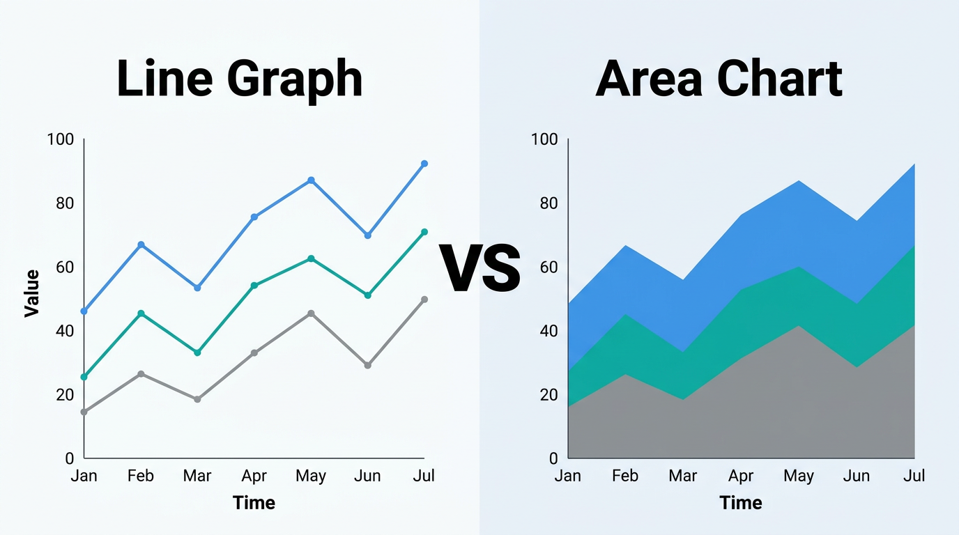
Line Graph vs Area Chart: Which Should You Use?
Line graphs and area charts share the same DNA — one just fills the space below the line. But that fill changes the message. Learn when the filled area adds meaning and when it creates confusion.
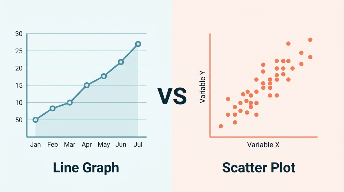
Line Graph vs Scatter Plot: How to Choose the Right Chart
Line graphs and scatter plots look similar but answer fundamentally different questions. Learn the key differences, when each chart type excels, and how to decide in under 30 seconds — with side-by-side examples.
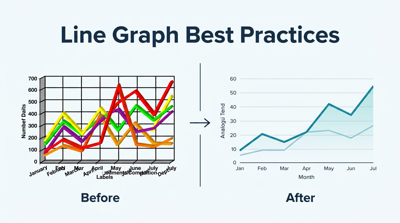
Line Graph Best Practices for Reports and Presentations
Design line graphs that communicate clearly in board decks, quarterly reports, and dashboards. Covers axis scaling, color choices, annotation, labeling, and the most common design mistakes to avoid.
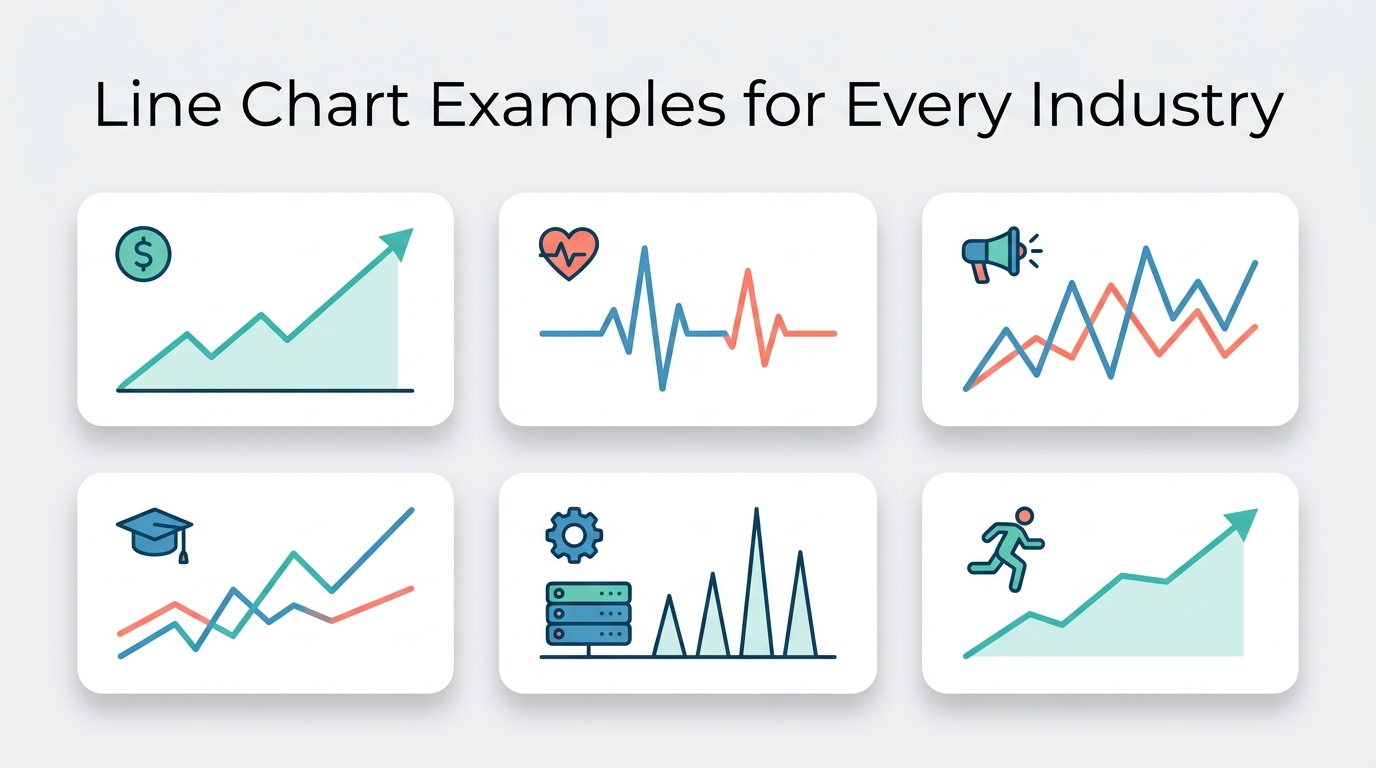
Line Chart Examples for Every Industry: 20+ Real-World Use Cases
See how line charts work across finance, healthcare, marketing, education, and more. Each example includes sample data, configuration tips, and the insight it reveals — ready to recreate in Line Graph Maker.
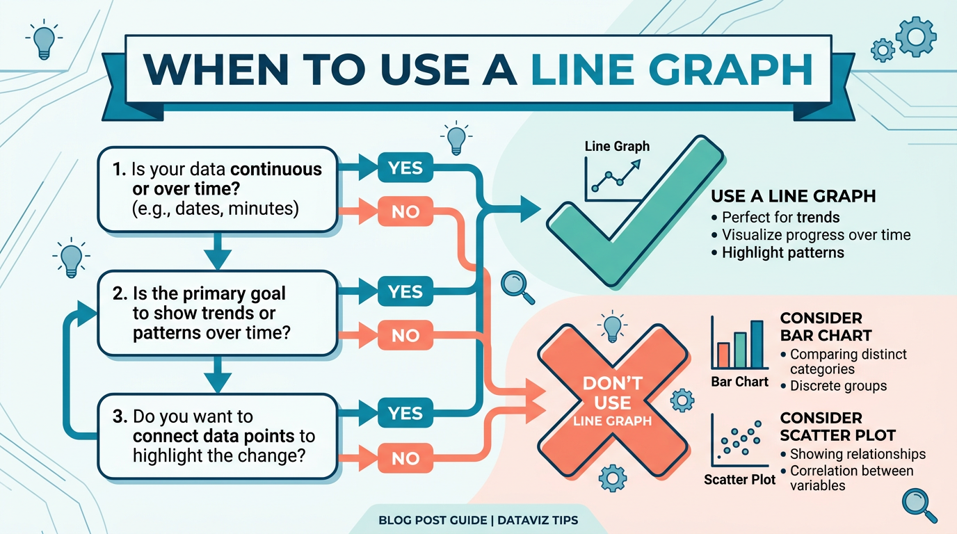
When to Use a Line Graph (and When Not To)
Not every dataset deserves a line graph. Learn the five conditions that make a line graph the right choice, the six scenarios where other charts work better, and a quick decision framework you can use in under 30 seconds.
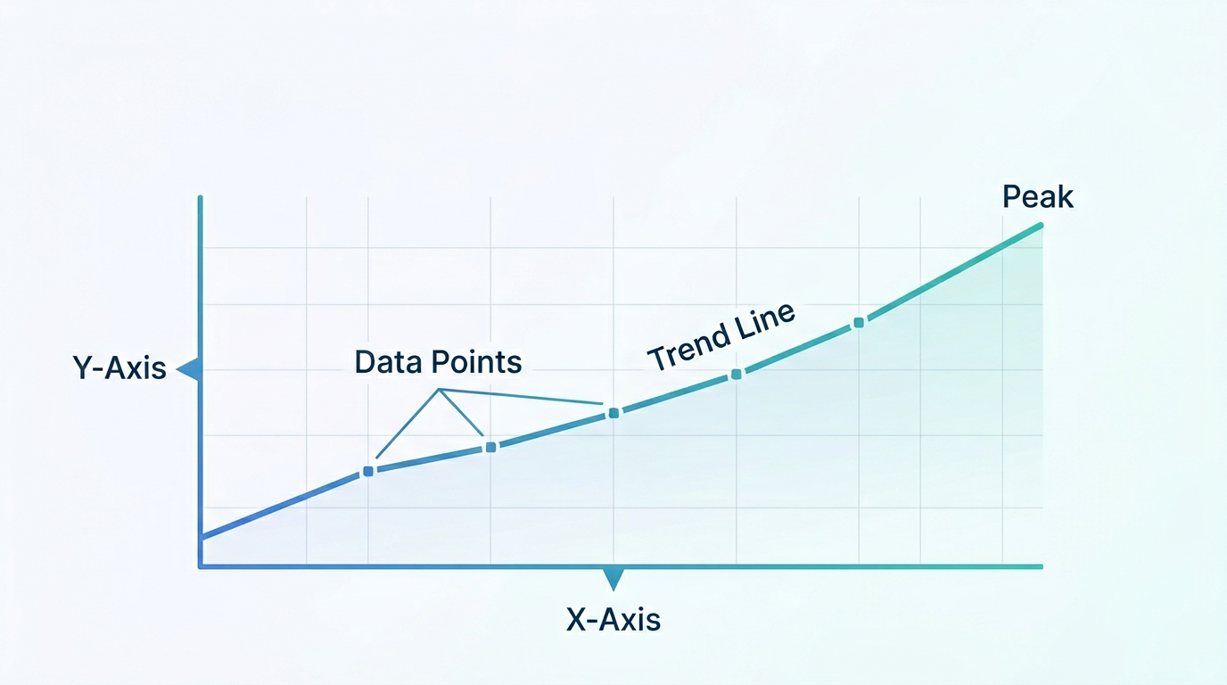
How to Read a Line Graph: A Complete Beginner's Guide
Master the art of reading line graphs in under 10 minutes. Learn to identify trends, compare series, spot outliers, and avoid the most common misreadings — with annotated examples you can practice on.
Create Your Line Chart in 3 Easy Steps
Our free online line graph maker makes chart creation simple and fast.
Add Your Data
Paste CSV data or use our interactive table editor. Upload files or enter data manually.
Customize Style
Choose chart type, colors, fonts, and more. Preview changes in real-time.
Export & Share
Download as PNG or SVG. Copy to clipboard or embed in your documents.
Frequently Asked Questions
Everything you need to know about our line graph maker.
Yes! All data processing happens entirely in your browser. Your data never leaves your device and is not sent to any server.
Still have questions?
Can't find the answer you're looking for? Feel free to reach out to our team.
Start Creating Your Chart