William Playfair: The Rogue Genius Who Invented the Graphs You See Everywhere
Have you ever glanced at a colorful pie chart in a news article or a simple bar graph in school? You might not think twice about them, but these everyday tools started with one man's wild ideas over 200 years ago. Meet William Playfair—the forgotten inventor behind bar charts, line graphs, and pie charts. You probably use his creations without knowing it, whether you're tracking your fitness goals or checking election results. In this article, we'll dive into his story like an adventure tale. You'll learn how a Scottish troublemaker changed the way you understand numbers, and why his genius still lights up your world today.
Who Was William Playfair? A Quick Peek into His Early Days
Picture this: It's 1759 in a small Scottish village called Liff, near Dundee. You're a young boy named William Playfair, full of curiosity but facing tough times. Your dad, a church minister, passes away when you're just 13, leaving you orphaned. But don't worry—you have a big brother, John, who's a brilliant math professor. He steps in like a hero from a storybook, teaching you something amazing: how to turn boring numbers into fun lines and shapes.
You see, John shows you daily temperature charts, proving that "whatever can be expressed in numbers, may be represented by lines." This sparks your love for visuals. By your late teens, you're off to England, apprenticed to the famous engineer James Watt, the guy behind the steam engine that powered the Industrial Revolution. You're drawing plans and crunching numbers, but Watt calls you a "blunderer" in a letter—ouch! Still, those skills stick with you, mixing art and math in ways no one else is doing yet.
Life isn't easy, though. You try your hand at silversmithing in London, but it flops. You even dream up a semaphore telegraph system—a way to send messages with flags—but no one bites. By now, you're in your 20s, hungry for adventure and a bit short on cash. This sets the stage for your bigger moves, including inventions that make data as easy to read as a comic book.
How Playfair Invented the Graphs That Make Data Fun and Simple
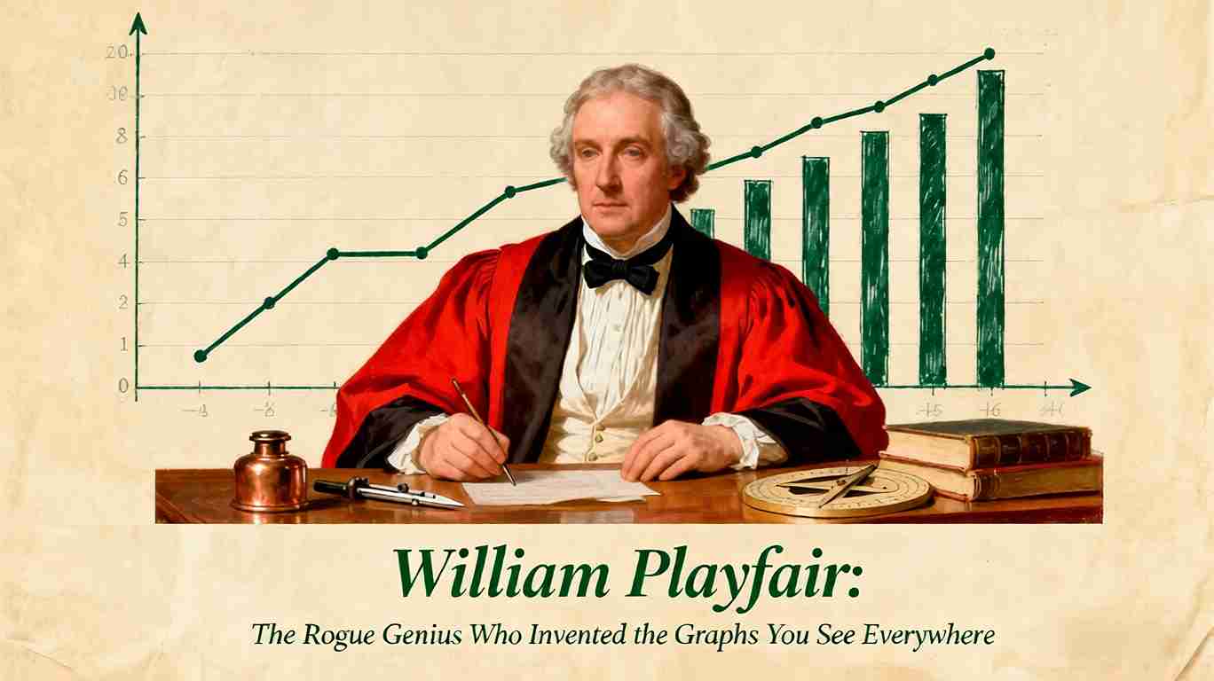
Fast-forward to 1786. You're 27, living in London, and you've got a big idea brewing. Numbers about trade—like how much Scotland sells to France versus England—are piling up in dusty tables. They're confusing, right? You decide to fix that with pictures. In your book, The Commercial and Political Atlas, you drop the world's first bar chart. Imagine thick, colorful bars rising like buildings to show Scotland's trading partners. Tall bar for big trade, short for small—boom, you get it in seconds!
But you're not done. Right next to it, you add the first line graph. This one's a wiggly line tracking England's imports and exports to Denmark over years, like a trail on a treasure map. You explain it simply: "The eye is the best judge of proportion." No more squinting at tiny figures; your graphs let anyone spot trends, like how war messes with prices.
Then, in 1801, while stuck in a London prison for debt (more on that wild side later), you create the pie chart in The Statistical Breviary. You're dividing up the Turkish Empire's land—Europe in red, Asia in green, Africa in yellow—like slicing a pizza. It's the first chart with colors to make slices pop. You say these tools are for busy folks: "Men of high rank, or active business, can only pay attention to outlines." Your graphs aren't fancy art; they're shortcuts to truth, turning dry stats into stories you can grasp fast.
Why did this matter back then? In the 1700s, smart people thought pictures were for kids or toys—not serious science. But you proved them wrong, even if it took years for the world to catch up.
The Thrilling (and Sketchy) Adventures of a Chart-Making Rogue
Okay, let's get real—your life reads like a spy novel, not a math textbook. After leaving Watt in 1781, you bounce around Europe like a pinball. In 1787, you're in Paris during the French Revolution, selling steam engines and pulling off a huge scam with the Scioto Company. You convince rich French nobles to buy "prime American land" in Ohio—except it's wild, Native American territory no one owns. When the truth hits, you flee just as the Bastille falls. Close call!
Back in London by 1793, you start a bank that crashes, landing you in Fleet Prison for debt in 1805. But hey, prison doesn't stop you—you write your pie chart book there! Later, you turn freelance spy for the British government. You sneak into France, crack their semaphore code (flag signals for secrets), and even plot to flood their money with fakes to crash the economy. In 1816, you try blackmailing a Scottish lord over a family secret—yikes, that backfires into a lawsuit.
Despite the drama, you keep publishing. By 1823, you're broke and alone in London, dying at 64 with no fanfare. Historians call you a "scoundrel" or "rascal," but that's what makes your story pop. You weren't perfect, but your brain for visuals? Pure gold. Imagine if you'd stuck to safe jobs—you might never have dreamed up graphs.
Evidence from experts backs this up. A Princeton University chapter notes you as the "ne'er-do-well younger brother" of a famous scientist, rubbing shoulders with Industrial Revolution stars. And JSTOR articles highlight how your Birmingham days sparked a "revolution" in graphics. Your messy life fueled your bold ideas.
Why Playfair's Genius Still Shapes Your World Today
Think about it: Every time you scroll Instagram stats or watch a weather forecast, you're seeing Playfair's handiwork. In our data explosion age—billions of numbers flying around daily—your simple graphs cut through the noise. Newspapers use pie charts for polls; schools teach line graphs for science projects. You can spot fake news faster or make smarter choices, like budgeting your allowance.
But it's more than tools; it's about curiosity. Playfair said stats are "dry and tedious" unless you spark imagination. Today, that's infographics on climate change or sports highlights. His legacy? Proving visuals make tough topics fun, helping you learn without boredom.
Experts agree. The American Scientist calls you a "visionary" who used graphs to sway Britain's economy. Utah State University credits you with early versions of modern stats graphics. Without you, data might still be locked in tables only experts read.
So next time you see a chart, tip your hat to William. You're living his dream—one glance at a time.
Frequently Asked Questions (FAQ)
Who exactly invented the pie chart? You guessed it—William Playfair did, in 1801. He sliced a circle to show land shares in the Turkish Empire, adding colors for the first time.
Was William Playfair really a spy? Yes! He spied for Britain, cracking French signal codes and plotting money scams during wars. His life was half genius, half thriller.
Why are Playfair's graphs still used today? They're simple and quick. Your eye grabs proportions faster than reading numbers, perfect for busy lives like yours.
Did Playfair get rich from his inventions? Nope—he died poor. His books sold okay, but scandals and bad luck kept money away.
Where can I see Playfair's original graphs? Check online scans of The Commercial and Political Atlas on sites like Project Gutenberg.
More Recommended Content
Want to dig deeper into data wizards and history? Here are picks for you:
- The Scottish Scoundrel Who Changed How We See Data: A fun read on Playfair's rogue side from Atlas Obscura.
- William Playfair: Inventor of the Bar Graph, Line Graph, and Pie Chart: Economics blog with cool graph images.
- A Visionary and a Scoundrel: Science mag piece on his big-picture impact.
- Explore data visualization history for more inventors like you.
Share this article
Help others discover this content
Published on November 9, 2025
Last updated on April 10, 2026