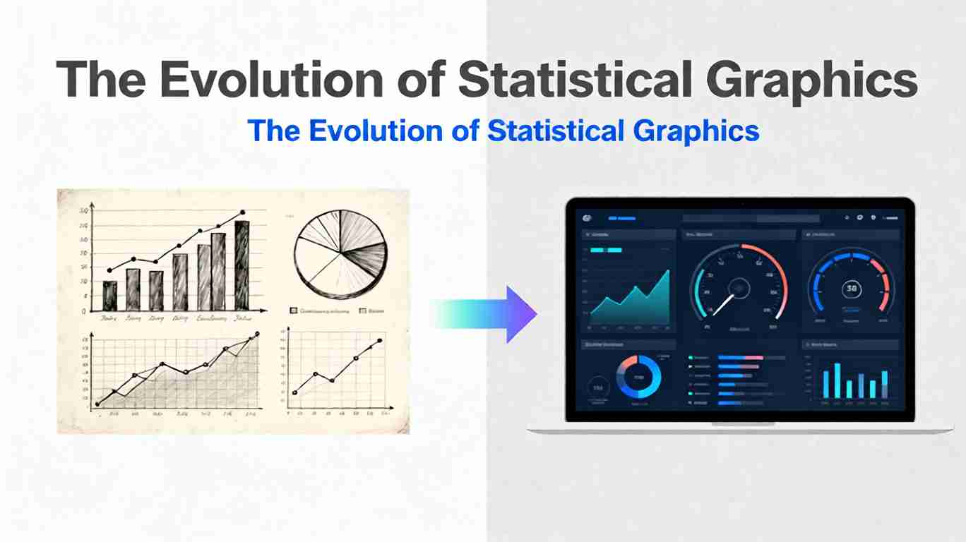
The Evolution of Statistical Graphics: From Bar Charts to Dashboards
Statistical graphics have always sat at the intersection of mathematics, design, and storytelling. Long before we spoke about analytics or business intelligence, people were already trying to turn raw numbers into shapes and lines that made sense at a glance. From William Playfair’s pioneering bar and line charts to today’s interactive dashboards monitoring millions of events per second, the history of statistical graphics is a story of how we’ve learned to think with our eyes.
This article traces that evolution: how we moved from simple static charts to rich, interactive dashboards—and what that journey teaches us about designing visualizations that remain clear, honest, and impactful in an age of data abundance.
Early Roots: Counting the World
The roots of statistical graphics stretch back to the 17th century, when governments and scholars began systematically collecting data about populations, trade, and disease. Early pioneers like John Graunt used tables and descriptive summaries to understand mortality patterns in London. The visualization tools were primitive, but the intent was already modern: use data to see hidden patterns in the world. A broader historical arc of these developments is outlined in resources on the history of data visualization.
Two forces pushed visualization forward:
- Growing data complexity: States and trading companies collected more data than could comfortably be held in text and tables.
- Political and scientific needs: Decisions about public health, taxation, and infrastructure demanded ways to communicate quantitative evidence to non-specialists.
At this stage, most “visualizations” were still elaborate tables or schematic diagrams. The leap to true statistical graphics would come with a shift from numbers in rows and columns to shapes plotted in space.
Playfair and the Rise of the Bar Chart
In the late 18th century, Scottish engineer and political economist William Playfair popularized many of the graphical forms we now take for granted. In works like The Commercial and Political Atlas (1786), he introduced or popularized:
- Bar charts for comparing quantities across categories.
- Line charts for showing change over time.
- Pie charts for illustrating parts of a whole.
The bar chart, in particular, was a breakthrough. The idea is deceptively simple: represent each value as the length of a bar, align the bars to a common baseline, and let the human visual system do the rest. Suddenly, comparisons that required careful reading of tables became almost instantaneous.
Playfair’s key contributions were not just technical but conceptual:
- Quantities as geometry: Numbers could be translated into visual encodings like length, area, and position.
- Time as a continuum: Line charts made it possible to see trends and cycles rather than merely compute them.
- Persuasion through graphics: Charts could support political and economic arguments more powerfully than prose alone.
These ideas remain foundational to statistical graphics today.
The Nineteenth-Century Golden Age of Statistical Graphics
The 19th century is often described as a golden age for statistical graphics. As states, empires, and scientific institutions expanded, so did the need to summarize and communicate data. Several iconic visualizations from this era remain case studies in effective design:
- Florence Nightingale’s polar area chart (1850s) showed causes of mortality in the Crimean War and argued convincingly for sanitary reforms. Her diagram combined statistical rigor with moral urgency and is frequently highlighted in discussions of Nightingale’s data-driven reforms.
- Charles Minard’s map of Napoleon’s 1812 Russian campaign (1869) fused geography, time, temperature, and troop size into a single devastating story of attrition. It is still cited as one of the greatest statistical graphics ever created and is widely analyzed in historical reviews of Minard’s graphic.
This period cemented two critical principles:
- Multidimensional storytelling: Graphics could combine several variables—in space, color, size, and time—to tell complex stories without overwhelming the viewer.
- Audience-centric design: The best graphics were crafted for specific audiences and decisions, not just to decorate reports.
Many of the visual conventions we still use—axes, legends, gridlines, and standardized scales—also matured during this century, making graphics more interpretable and comparable.
Statistics, Mass Media, and the 20th Century
The 20th century brought three major shifts that reshaped statistical graphics:
- The rise of formal statistics: As statistical methods became more sophisticated, so did their visual companions: histograms, scatterplots, box plots, residual plots, and more. These were not just for communication but for discovery—tools to diagnose models, detect outliers, and reveal structure in data.
- Mass printing and journalism: Newspapers and magazines began using charts to explain elections, economic trends, and social changes to broad audiences. Visualizations moved from specialist reports into everyday media.
- Computers and plotting software: Early computer graphics in the mid-20th century began to automate the creation of charts. By the 1980s and 1990s, statistical software like SAS, SPSS, S-PLUS, and later R made it easy to generate plots programmatically.
Throughout this era, influential voices like John Tukey and later Edward Tufte argued for graphics that were both analytical and aesthetic. Tufte in particular emphasized:
- Align with human perception People detect differences in aligned bars more accurately than in slices of a pie. Dashboards that rely heavily on tricky encodings (like 3D charts) sacrifice clarity. For deeper guidance on perceptual effectiveness, designers often refer to curated resources such as the Data Visualization Catalogue.
- High data-to-ink ratios.
- Avoidance of “chartjunk.”
- Careful scales and honest representations of magnitude.
These ideas laid the ethical and design foundations for the coming explosion of digital visualization.
From Static Charts to Interactive Visualization
The shift from static print graphics to interactive digital visualizations began in earnest in the late 20th century and accelerated in the early 21st. Several technological and cultural factors converged:
- Personal computing and GUIs made graphical exploration possible for non-programmers.
- The web turned visualizations into interactive experiences, not just images on a page.
- Open-source ecosystems (notably R and later Python libraries like Matplotlib, ggplot2, D3.js, and Plotly) empowered analysts, designers, and journalists to create bespoke visualizations.
Interactivity changed the role of statistical graphics in three fundamental ways:
- From answers to tools: Charts became interactive instruments for exploring data, not just for presenting conclusions.
- From fixed views to multiple slices: Users could filter, zoom, and pivot across dimensions, seeing the same data set from many angles.
- From single charts to visual systems: Instead of one chart per page, visualizations increasingly appeared in coordinated sets—foreshadowing the modern dashboard.
The bar chart, meanwhile, adapted gracefully to this new world—turning into sortable, filterable, and drillable bar charts in dashboards and web apps.
The Emergence of Dashboards
Dashboards emerged as a response to a new problem: organizations were drowning in data but starved for clarity. Executives and operators needed:
- At-a-glance summaries of key metrics.
- Real-time monitoring of systems and processes.
- Shared views that aligned teams around the same numbers.
Modern dashboards combine multiple chart types—bars, lines, area charts, KPIs, maps, and more—into a single, coherent layout. Tools like Tableau, Power BI, Looker, and open-source frameworks made it possible to:
- Connect directly to live data sources.
- Define interactive filters and drill-down paths.
- Standardize visual templates across teams.
Conceptually, a dashboard is a meta-visualization: not just one statistical graphic but a carefully orchestrated ensemble. Its design challenges are closer to information architecture and product design than to drawing a single chart.
Design Principles that Persist from Bar Charts to Dashboards
Despite all the technological shifts, several principles have remained remarkably consistent from Playfair’s early charts to today’s full-screen dashboards:
- Respect the visual encoding Use position and length for precise comparisons; reserve area, color, and angle for more approximate signals.
- Align with human perception People detect differences in aligned bars more accurately than in slices of a pie. Dashboards that rely heavily on tricky encodings (like 3D charts) sacrifice clarity.
- Prioritize comparisons The core power of statistical graphics is comparative: before/after, this vs. that, target vs. actual. Good dashboards make those comparisons effortless.
- Balance overview and detail Effective dashboards provide a high-level view with the ability to drill into specific segments or time ranges when needed.
- Keep integrity non-negotiable Truncated axes, distorted scales, and misleading aggregation can all make dashboards more dramatic but less truthful. The ethical standards forged in early statistical graphics still apply.
The evolution of statistical graphics is not just about adding more charts; it is about learning how to combine them while preserving clarity and trust.
Challenges of the Dashboard Era
Dashboards solve many problems but introduce new ones:
- Information overload: It is tempting to fill every pixel with charts, KPIs, and alerts. Overloaded dashboards quickly become noisy and ignored.
- Metric fragmentation: Different teams may define the same metric in slightly different ways, leading to “dueling dashboards” and eroded trust.
- False precision: Real-time, high-granularity data can give the illusion of control even when underlying processes are noisy.
- Attention drift: Users grow numb to static dashboards over time; alerts, anomalies, and contextual cues are needed to keep attention focused on what matters.
These challenges force designers to think not just about what to show but about how dashboards fit into real decision workflows. A beautiful dashboard that nobody uses has failed, no matter how technically sophisticated the charts are.
Looking Ahead: Beyond Dashboards
As data volumes grow and AI advances, the future of statistical graphics is likely to become:
- More adaptive: Systems that automatically suggest the most appropriate visualization for a given question or data shape. Early research on dashboard design patterns and trade-offs explores how layout, interactivity, and information density can be systematically tuned.
- More conversational: Interfaces where users ask questions in natural language and receive both narrative explanations and dynamic graphics.
- More immersive: Specialized domains may adopt 3D, VR, or AR visualizations where spatial structure is central (e.g., urban planning, molecular biology).
- More personalized: Dashboards that adapt to roles, preferences, and cognitive styles, reducing noise and surfacing the most relevant patterns.
Yet even in these futuristic scenarios, the core lessons from the bar chart era remain vital: choose honest encodings, emphasize comparisons, and design for understanding rather than spectacle.
Practical Takeaways for Modern Practitioners
If you design charts, reports, or dashboards today, the history of statistical graphics offers some concrete guidance:
- Start simple: Begin with bar charts, line charts, and scatterplots before considering exotic forms. Complexity should serve a purpose, not aesthetics alone. Frameworks like the Data-Driven Documents (D3.js) library or high-level tools built on top of it can help you scale from simple charts to rich, interactive systems without abandoning fundamental principles.
- Tell a coherent story: Whether it is a single chart or a full dashboard, guide the viewer through a narrative: context, key findings, implications, and next steps.
- Design for your audience: An executive dashboard, a scientific figure, and a public data story all demand different levels of detail, jargon, and interactivity.
- Continuously iterate: Treat dashboards as living products, not one-off deliverables. Observe how people use them, gather feedback, and refine layouts and metrics over time.
- Invest in data literacy: The best visualization cannot compensate for misunderstandings about what metrics mean. Pair dashboards with training and clear definitions.
Seen this way, the evolution from bar charts to dashboards is not a story of replacement but of accumulation. Each generation of tools builds on the previous one, adding new capabilities while retaining the core logic of encoding data visually for human judgment.
FAQ
Q1: Are bar charts still relevant in the age of complex dashboards? Yes. Bar charts remain one of the most reliable, interpretable tools for comparing categorical values. Many effective dashboards rely heavily on bar and line charts, reserving more complex visual forms for specialized tasks.
Q2: When should I use a dashboard instead of a static report? Dashboards shine when stakeholders need to monitor metrics regularly, explore different segments, or react to changes in near real time. If your primary goal is to document a one-time analysis or tell a linear story, a well-structured static report or presentation may be more effective. Many analytics teams draw inspiration from best-practice resources published by vendors such as Tableau’s dashboard design guidelines when making this distinction.
Q3: How many charts should a dashboard contain? There is no fixed number, but effective dashboards usually focus on a small set of essential questions. A good heuristic is that a stakeholder should be able to understand the state of their domain within 30–60 seconds. If that is not possible, consider removing or consolidating elements.
Q4: What are common mistakes to avoid when designing dashboards? Common pitfalls include inconsistent metric definitions, overuse of color, unnecessary 3D effects, overcrowded layouts, and ignoring mobile or small-screen contexts. Another frequent mistake is skipping user research and assuming that a visually polished layout will automatically be useful.
Q5: How can AI help improve statistical graphics and dashboards? AI can assist with automating data preparation, recommending appropriate chart types, detecting anomalies, and generating narrative explanations alongside visuals. However, human judgment remains essential for defining meaningful metrics, understanding context, and ensuring that visualizations are honest, relevant, and aligned with real decisions. For a broader context on how interactive visual analytics and machine learning intersect, you can explore survey work and position papers from venues like IEEE VIS and related visualization research communities.
Share this article
Help others discover this content
Published on November 17, 2025