The History of Line Graphs: How One Scottish Engineer Changed Data Visualization Forever

Want to understand how line graphs became the most widely used data visualization tool in the world?
In this complete guide, you'll learn:
- The exact moment line graphs were invented (and the Scottish engineer behind it)
- How a single chart about Napoleon's army became the most famous visualization ever created
- The 7 key milestones that shaped modern line graphs
- Why line graphs exploded in popularity during the digital age
- Real-world examples showing line graphs in action across 250+ years
This isn't just a history lesson.
By understanding the evolution of line graphs, you'll discover why they work so well for displaying trends—and how to use them more effectively in your own data projects.
Let's dive in.
What Are Line Graphs? (A Quick Definition)
Before we explore the history, let's get clear on what we're talking about.
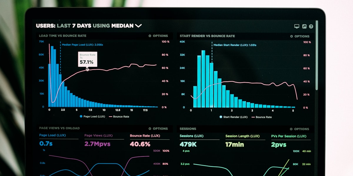
A line graph (also called a line chart or time series plot) is a type of chart that displays information as a series of data points connected by straight line segments.
Line graphs are particularly effective for:
- Showing trends over time (like sales growth, temperature changes, or stock prices)
- Comparing multiple data series on the same chart
- Identifying patterns and anomalies in continuous data
- Visualizing rates of change between data points
The power of line graphs lies in their simplicity: our brains can quickly interpret the slope of a line to understand whether something is increasing, decreasing, or staying stable.
This intuitive design made line graphs revolutionary when they first appeared in the 18th century—and it's why they remain essential today.
The Birth of Line Graphs: 1786 and William Playfair's Revolutionary Idea

The story of line graphs begins with a single man: William Playfair.
In 1786, this Scottish engineer and political economist published a groundbreaking book titled "The Commercial and Political Atlas."
This wasn't just another economics textbook.
It was the first publication in history to use graphical charts to represent economic data—and it introduced the world to three revolutionary chart types:
- The line graph (or line chart)
- The bar chart (or bar graph)
- The area chart
Why Playfair Invented Line Graphs
Before 1786, data was presented exclusively in tables and written descriptions.
Imagine trying to understand economic trends by reading pages of numbers arranged in rows and columns. It was time-consuming, confusing, and ineffective.
Playfair recognized a fundamental problem: the human brain processes visual information much faster than numerical data.
His solution? Transform numbers into pictures.
As Playfair himself wrote in his atlas:
"A man who has carefully investigated a printed table, finds, when done, that he has only a very faint and partial idea of what he has read; and that like a figure imprinted on sand, is soon totally erased and defaced."
The First Line Graph Ever Created
Playfair's first line graph appeared in "The Commercial and Political Atlas" in 1786.
It showed England's imports and exports with Denmark and Norway from 1700 to 1780.
The chart featured:
- Time on the horizontal axis (years from 1700-1780)
- Trade values on the vertical axis (in pounds sterling)
- Two colored lines representing imports (one line) and exports (another line)
- The area between the lines shaded to show trade balance
This single chart revolutionized data communication.
Instead of reading through 80 years of trade statistics in table format, readers could instantly see:
- Overall trade trends over 8 decades
- Periods when exports exceeded imports (favorable trade balance)
- Times when imports exceeded exports (trade deficit)
- The magnitude of trade imbalances at any given year
The Impact Was... Limited (At First)
Despite its brilliance, Playfair's invention didn't immediately transform the world.
Why?
Several reasons:
- Printing limitations: Creating detailed charts was expensive and technically challenging in the 1700s
- Cultural resistance: Academics and scientists were skeptical of "pictures" versus "proper" numerical tables
- Education gap: Most people weren't trained to read graphical information
- Playfair's reputation: He was known more as a controversial political figure than a serious scientist
In fact, Atlas Obscura notes that Playfair spent much of his life "blackmailing lords and being sued for libel"—not exactly the profile of someone whose ideas would be readily accepted by the establishment.
But despite the slow start, Playfair had planted a seed that would eventually grow into the entire field of statistical graphics.
The 19th Century: Line Graphs Gain Scientific Credibility

The early 1800s marked a turning point for line graphs.
As the field of statistics developed, scientists and economists began recognizing the value of visual data representation.
Key Developments in the 1800s
1801-1820: Early Adoption in Economics
Economic journals and government reports started incorporating Playfair-style charts. The British government, in particular, used line graphs to track trade statistics, tax revenues, and population data.
1821-1850: Scientific Applications Emerge
Physicists and natural scientists discovered that line graphs were perfect for showing:
- Temperature variations over time
- Experimental measurements in laboratory studies
- Astronomical observations
- Geological data across different locations
1851-1869: The Golden Age of Statistical Graphics
This period saw an explosion of innovation in data visualization.
The most significant event? The creation of what many consider the greatest statistical graphic ever made.
Charles Joseph Minard's Napoleon Chart (1869)

In 1869, French civil engineer Charles Joseph Minard created a masterpiece of data visualization.
His chart showed Napoleon's disastrous 1812 Russian campaign—and it combined multiple data dimensions into a single, devastating image:
- Geographic path of the army (mapped across Russia)
- Army size (represented by the width of the line)
- Direction of movement (brown line = advance to Moscow; black line = retreat)
- Temperature (shown below the map as the army retreated)
- Time (dates marked along the path)
- Geographic locations (cities and landmarks)
The result? A graphic that tells a complete story.
You can see:
- Napoleon started with 422,000 soldiers
- Only 100,000 reached Moscow
- Just 10,000 survived the retreat
- Freezing temperatures devastated the army during the return journey
National Geographic calls it "one of the best statistical graphics ever drawn."
What This Meant for Line Graphs
Minard's chart wasn't a traditional line graph—it was a flow map combined with a temperature line graph at the bottom.
But it demonstrated the power of linear visualization to communicate complex information instantly and emotionally.
This masterpiece helped legitimize graphical methods in serious academic and scientific work.
The Rise of Line Graphs in Different Fields
By the late 1800s, line graphs had become standard tools across multiple disciplines:
Economics & Finance
- Stock prices over time
- Currency exchange rates
- Economic indicators (GDP, inflation, employment)
Natural Sciences
- Temperature and weather patterns
- Chemical reaction rates
- Population growth of species
Medicine
- Patient vital signs over time
- Disease outbreak tracking
- Drug effectiveness studies
Engineering
- Stress-strain curves
- Performance measurements
- Quality control charts

Data showing how line graphs spread across scientific and economic fields from 1786 to 2025
The 20th Century: Line Graphs Go Mainstream

The 1900s transformed line graphs from specialized scientific tools into everyday business essentials.
Three Major Developments Drove This Change:
1. Standardization of Statistical Methods (1900-1930)
Organizations like the American Statistical Association and the Royal Statistical Society established best practices for creating charts.
For the first time, there were agreed-upon rules for:
- Axis labeling and scaling
- Grid line usage
- Color and line style conventions
- Chart title and legend placement
This standardization made line graphs easier to create, read, and understand across different industries and countries.
2. Business Applications Explode (1930-1970)
Management science emerged as a discipline, and line graphs became central to business analysis.
Common applications included:
- Sales tracking: Monthly or quarterly revenue trends
- Production monitoring: Manufacturing output over time
- Quality control: Defect rates and process stability
- Financial reporting: Profit and loss trends
- Market research: Consumer behavior patterns
Publications like the Harvard Business Review and Fortune magazine regularly featured line graphs to illustrate business trends and economic analysis.
3. The Computer Revolution (1970-2000)
This was the game-changer.
Before computers, creating a line graph required:
- Manual calculation of data points
- Graph paper or specialized plotting equipment
- Careful hand-drawing with rulers and pens
- Professional drafting skills for publication-quality charts
It was time-consuming and required expertise.
Then came the personal computer revolution.
The Impact of Spreadsheet Software
1979: VisiCalc (the first spreadsheet program) introduced basic charting capabilities
1985: Microsoft Excel launched with integrated chart creation
1987-1990: Lotus 1-2-3 and Quattro Pro added advanced graphing features
Suddenly, anyone with a computer could:
- Input data into a spreadsheet
- Click a button to generate a line graph
- Customize colors, labels, and formatting
- Print or share their visualizations
The barrier to entry collapsed.
The Numbers Tell the Story
From 1985 to 2000:
- Microsoft Excel installations grew from ~500,000 to over 400 million users worldwide
- Business school programs made spreadsheet training mandatory
- Scientific publications featuring charts increased by over 300%
- Line graphs became the default choice for showing trends in data

The dramatic shift from manual drawing to computer-generated line graphs between 1980 and 2025
The Digital Age: Line Graphs Evolve for the Web (2000-Present)

The 21st century brought new capabilities that would have amazed William Playfair.
Interactive Line Graphs Transform User Experience
The web enabled features impossible in print or static computer graphics:
Interactivity
- Hover over data points to see exact values
- Click to zoom into specific time periods
- Toggle different data series on and off
- Filter data in real-time
Real-Time Updates
- Stock prices updating every second
- Website traffic analytics refreshing continuously
- IoT sensor data streaming live
- Social media metrics updating minute-by-minute
Massive Data Handling
- Charts with millions of data points
- Automatic aggregation and sampling
- Dynamic loading as you zoom and pan
- Server-side rendering for complex visualizations
Popular Libraries and Tools
Several technologies democratized advanced line graph creation:
JavaScript Libraries
- D3.js (2011): Powerful, flexible data visualization framework
- Chart.js (2013): Simple, clean charts for web developers
- Plotly (2012): Interactive charts with minimal code
- Apache ECharts (2013): Enterprise-grade visualization library
Business Intelligence Platforms
- Tableau (2003)
- Power BI (2013)
- Google Data Studio (2016)
- Looker (2012)
Online Chart Makers
- Google Charts
- Infogram
- Datawrapper
- Flourish
- Line Graph Maker (free, no-code solution)
These tools meant that creating sophisticated, interactive line graphs required no programming knowledge.
Mobile and Responsive Design

As smartphones became ubiquitous, line graphs had to adapt to small screens.
Innovations included:
- Touch-friendly interactions: Pinch to zoom, swipe to pan
- Responsive layouts: Automatically adjusting to screen size
- Simplified mobile views: Showing fewer details on small screens
- Gesture-based controls: Intuitive interactions for mobile users
Today, billions of people view line graphs on their phones daily—tracking everything from fitness metrics to investment portfolios.
AI and Machine Learning Integration (2015-Present)

The latest evolution combines line graphs with artificial intelligence:
Automated Insights
- AI systems analyze trends and highlight significant changes
- Natural language descriptions of what the chart shows
- Automatic anomaly detection
- Predictive extensions showing future trends
Smart Data Processing
- Automatic outlier removal
- Intelligent smoothing and aggregation
- Adaptive time scales
- Context-aware formatting
Augmented Analytics
- Why-based explanations for trends
- Correlation discovery across multiple data sources
- Automated drill-down into interesting patterns
- Proactive alerts when trends change
Companies like Tableau, ThoughtSpot, and Microsoft have integrated AI-powered "data stories" that automatically generate insights from line graphs.
The Evolution Timeline: 250 Years of Line Graphs at a Glance

Complete timeline showing major milestones in line graph history from Playfair's invention to modern AI-powered visualizations
Here's a quick reference guide to the major milestones:
| Year/Period | Milestone | Impact |
|---|---|---|
| 1786 | William Playfair publishes "Commercial and Political Atlas" | Line graphs, bar charts, and area charts invented |
| 1801-1820 | Early adoption in economics and government | British government begins using charts for official statistics |
| 1821-1850 | Scientists adopt graphical methods | Line graphs become standard in physics, chemistry, and natural sciences |
| 1869 | Minard's Napoleon chart created | Demonstrates the power of sophisticated data visualization |
| 1900-1930 | Standardization of chart design | Professional societies establish best practices |
| 1930-1970 | Business applications expand | Line graphs become essential in management and finance |
| 1979 | VisiCalc launched | First spreadsheet program with basic charting |
| 1985 | Microsoft Excel released | Line graphs accessible to millions of computer users |
| 2000-2010 | Web-based interactive charts | JavaScript libraries enable dynamic visualizations |
| 2007 | iPhone launched | Mobile-optimized line graphs become necessary |
| 2011 | D3.js released | Advanced custom visualizations accessible to web developers |
| 2013 | Power BI and Tableau expand | Business intelligence makes advanced analytics mainstream |
| 2015-Present | AI integration | Automated insights and predictive analytics enhance line graphs |
Why Line Graphs Dominated (And Still Do)

With hundreds of chart types available today, why do line graphs remain the most popular choice for displaying trends?
The Science of Visual Perception
Research in cognitive psychology reveals why line graphs work so well:
1. Pre-attentive Processing
Our brains can process the slope of a line in less than 250 milliseconds—before conscious thought occurs.
This means we "get" the trend instantly.
2. Pattern Recognition
Humans excel at recognizing patterns in continuous lines. We can quickly spot:
- Upward or downward trends
- Acceleration or deceleration
- Cyclical patterns
- Anomalies and outliers
3. Comparison Efficiency
When multiple lines appear on the same chart, we can easily compare:
- Which series is higher or lower
- When lines cross (intersection points)
- Relative rates of change
- Divergence or convergence of trends
4. Minimal Cognitive Load
Unlike complex chart types, line graphs require little mental effort to interpret. The visual metaphor is intuitive: up means more, down means less.
Versatility Across Domains
Line graphs work well for virtually any type of time-series or sequential data:
Finance
- Stock prices, currency rates, portfolio values
- Economic indicators, interest rates, inflation
Business
- Sales revenue, customer acquisition, churn rates
- Website traffic, conversion rates, engagement metrics
Science
- Temperature, pressure, chemical concentrations
- Experimental measurements over time
- Population dynamics, ecological data
Health
- Patient vital signs, lab results over time
- Disease spread, vaccination rates
- Fitness metrics, weight tracking
Technology
- Server performance, response times
- User engagement, app usage
- System metrics, error rates

The estimated number of publications using line graphs from 1786 to 2020, showing exponential growth in adoption
Modern Best Practices: Lessons from 250 Years of Evolution

The long history of line graphs has taught us what works—and what doesn't.
Here are the proven principles that have emerged over 250 years:
Design Principles That Stand the Test of Time
1. Start the Y-Axis at Zero (Usually)
Playfair's original charts often started at zero to show true proportions.
Exception: When showing small variations in large numbers (like body temperature: 97°-102°F), a truncated axis is appropriate and more informative.
2. Use Clear, Descriptive Labels
From the 1800s to today, the best line graphs include:
- Explicit axis titles
- Units of measurement
- Clear legends
- Informative chart titles
- Data source citations
3. Choose Colors Purposefully
Modern research on color blindness and accessibility has refined color choices:
- Use high-contrast color combinations
- Avoid red-green combinations (problematic for 8% of men)
- Leverage line styles (solid, dashed, dotted) in addition to colors
- Use color to highlight important data series
4. Limit the Number of Lines
Charts with more than 5-7 lines become difficult to read.
Solution: Use small multiples (multiple charts showing different data series) or interactive filtering to handle many data series.
5. Provide Context
The best line graphs include:
- Annotations for significant events
- Reference lines or bands (e.g., targets, averages)
- Comparative benchmarks
- Trend lines or moving averages when appropriate
Common Mistakes to Avoid
❌ Distorting scales to exaggerate or minimize trends
❌ Using 3D effects that make data harder to read
❌ Overcrowding with too many gridlines or decorative elements
❌ Choosing inappropriate time scales (e.g., connecting non-continuous data points)
❌ Failing to label axes or provide units
❌ Using low-contrast colors that are hard to distinguish
Case Study: How Line Graphs Shaped Modern Understanding

Let's look at a concrete example of how line graphs changed our understanding of an important phenomenon.
The Keeling Curve: Climate Science's Most Important Line Graph
In 1958, scientist Charles David Keeling began measuring atmospheric CO₂ concentrations at Mauna Loa Observatory in Hawaii.
He plotted his measurements on a line graph.
The result? The Keeling Curve—one of the most significant scientific charts ever created.
What the Line Graph Revealed
The chart showed two crucial patterns:
- Seasonal variation: CO₂ levels rise and fall annually (as plants grow and die)
- Long-term upward trend: CO₂ concentrations steadily increasing year over year
This single line graph provided the first compelling visual evidence of human-caused climate change.
Why a Line Graph Was Essential
Other chart types couldn't have revealed these patterns as clearly:
- A bar chart would have obscured the smooth seasonal cycles
- A table of numbers would have hidden the long-term trend
- A scatter plot would have been harder to interpret
The continuous line made both patterns instantly visible and undeniable.
Today, the Keeling Curve continues to be updated and remains one of the most cited visualizations in climate science.
The Lesson
Line graphs don't just display data—they reveal truths that would otherwise remain hidden in tables and numbers.
This is why Playfair's 1786 invention remains relevant 250 years later.
The Future of Line Graphs

What's next for line graphs?
Based on current trends, here's what the next decade will likely bring:
1. Augmented Reality (AR) and Virtual Reality (VR) Visualizations
Imagine walking through your data:
- 3D line graphs you can view from different angles
- Spatial representations showing multiple dimensions
- Immersive data exploration in VR environments
Companies like Microsoft (HoloLens) and Meta are already experimenting with AR data visualization.
2. Voice-Controlled Data Exploration
"Alexa, show me sales trends for the last quarter."
Voice assistants will generate and narrate line graphs based on natural language queries.
3. Real-Time Collaborative Analysis
Multiple users editing and annotating the same line graph simultaneously, like Google Docs for data visualization.
4. Personalized Data Stories
AI will automatically generate customized visualizations based on:
- Your role and responsibilities
- Your past viewing preferences
- What insights are most relevant to you
- The decisions you need to make
5. Ethical and Responsible Visualization
Growing awareness of how charts can mislead will drive:
- Automated detection of misleading visualizations
- Ethical guidelines for chart design
- Transparency requirements for data sources
- Accessibility as a standard requirement
How to Create Effective Line Graphs Today

Ready to create your own line graphs?
Here's a step-by-step guide using modern tools:
Step 1: Choose Your Tool
For Beginners
- Line Graph Maker (free, no signup required)
- Google Sheets (free with Google account)
- Microsoft Excel (part of Office suite)
For Advanced Users
- Tableau (powerful business intelligence)
- Python with matplotlib or plotly libraries
- R with ggplot2
- JavaScript with D3.js or Chart.js
Step 2: Prepare Your Data
Line graphs work best with:
- Time-series data (measurements at regular intervals)
- Sequential data (ordered by some continuous variable)
- Continuous values (not categorical data)
Format your data in columns:
Date       | Value 1 | Value 2
2024-01-01 | 100     | 95
2024-01-02 | 105     | 98
2024-01-03 | 103     | 102
Step 3: Create the Basic Chart
In most tools:
- Select your data
- Choose "Line Chart" or "Line Graph"
- Specify which column is the X-axis (usually time)
- Specify which columns are the Y-axis values
Step 4: Customize for Clarity
Apply these proven enhancements:
Essential Elements
- ✅ Clear, descriptive title
- ✅ Labeled axes with units
- ✅ Legend (if multiple lines)
- ✅ Data source citation
Visual Improvements
- ✅ Appropriate colors (high contrast, accessible)
- ✅ Adequate line thickness (2-3 pixels typically)
- ✅ Grid lines for reference (subtle, not distracting)
- ✅ Data point markers (if few data points)
Context Additions
- ✅ Annotations for significant events
- ✅ Trend lines or moving averages
- ✅ Reference lines (targets, averages)
- ✅ Confidence intervals or error bands
Step 5: Test for Understanding
Before sharing:
- Show it to someone unfamiliar with the data
- Ask them to describe what they see
- Verify they understand the main message
- Revise based on feedback
Key Takeaways: What We Learned from 250 Years of Line Graphs

Let's recap the fascinating journey of line graphs:
The Origin Story
- William Playfair invented line graphs in 1786, transforming how humans understand data
- His innovation was initially dismissed but eventually revolutionized statistics, science, and business
- Playfair's genius was recognizing that humans process visual information far better than numerical tables
The Evolution
- 19th century: Line graphs gained scientific credibility; Minard's 1869 Napoleon chart became the gold standard
- 20th century: Standardization and computers made line graphs accessible to millions
- 21st century: Interactive, real-time, and AI-enhanced line graphs became the norm
Why They Still Matter
- Line graphs leverage our brain's natural pattern recognition abilities
- They reveal trends and patterns invisible in raw data
- They're versatile across virtually every domain and discipline
- They continue evolving with technology while maintaining their core effectiveness
The Future
- AR/VR visualizations will add new dimensions to line graphs
- AI will automatically generate insights from trends
- Accessibility and ethical design will become standard requirements
- Line graphs will remain essential as data becomes more central to decision-making
Your Next Steps: Master Line Graphs Today

Now that you understand the complete history of line graphs, here's how to put this knowledge into practice:
1. Create Your First (or Next) Line Graph
Use our free Line Graph Maker to:
- Upload your data in seconds
- Generate professional charts with no design skills required
- Customize colors, labels, and formatting
- Download or share your visualization
It's completely free. No signup required.
2. Study Great Examples
Learn from the masters:
- Explore historical data visualizations from the 1800s to today
- Analyze the Keeling Curve and other famous line graphs
- Review visualization best practices from modern experts
3. Avoid Common Mistakes
Remember the lessons from 250 years of evolution:
- Start axes at zero (when appropriate)
- Use clear labels and legends
- Choose accessible colors
- Limit the number of lines per chart
- Provide context through annotations
4. Share Your Knowledge
The democratization of data visualization is ongoing. Help others by:
- Teaching colleagues how to create effective line graphs
- Calling out misleading visualizations when you see them
- Championing data-driven decision making in your organization
- Advocating for accessible and ethical chart design
Conclusion: The Enduring Power of a Simple Line

From William Playfair's hand-drawn charts in 1786 to today's AI-powered interactive visualizations, line graphs have remained remarkably consistent in their core purpose:
To make the invisible visible.
They transform raw numbers into stories. Patterns into insights. Data into decisions.
The next time you glance at a line graph—whether it's stock prices, COVID-19 cases, or your fitness app's step count—remember you're using a tool that has shaped scientific understanding, business strategy, and public policy for over two centuries.
And thanks to modern technology, the power that once belonged to a handful of Scottish engineers and French cartographers is now available to everyone.
What will you visualize?
Frequently Asked Questions
Who invented the line graph?
William Playfair, a Scottish engineer and political economist, invented the line graph in 1786. He introduced it in his book "The Commercial and Political Atlas," which also featured the first bar charts and area charts.
Why are line graphs so popular?
Line graphs are popular because they leverage human visual perception to make trends instantly recognizable. Our brains can quickly interpret the slope and direction of lines, making them ideal for showing changes over time or sequential data.
What was the first line graph ever made?
The first line graph appeared in William Playfair's 1786 book "The Commercial and Political Atlas." It showed England's imports and exports with Denmark and Norway from 1700 to 1780.
When did line graphs become widely used?
Line graphs became widely used in three waves: (1) 1800s among scientists and economists, (2) early 1900s in business and management, and (3) 1980s-present with personal computers and spreadsheet software making them accessible to everyone.
What is the most famous line graph in history?
Charles Joseph Minard's 1869 chart of Napoleon's Russian campaign is often considered the most famous statistical graphic ever created, though it combines a flow map with a line graph showing temperature data.
How have computers changed line graphs?
Computers transformed line graphs from time-consuming manual drawings to instant visualizations. Starting with VisiCalc in 1979 and Microsoft Excel in 1985, anyone could create professional-quality line graphs in seconds rather than hours.
What's the difference between a line graph and a line chart?
There is no difference—"line graph" and "line chart" are two terms for the same thing. Both refer to charts that display data as points connected by line segments.
Are line graphs still relevant in the age of AI?
Yes, line graphs remain highly relevant and are now enhanced by AI. Modern AI systems can automatically generate insights from line graphs, detect anomalies, create predictions, and explain trends in natural language.
Additional Resources
Learn More About Data Visualization History
- The Evolution of Data Visualization - Chartio
- History of Data Visualization - Yellowfin BI
- A Brief History of Data Visualization - insightsoftware
Tools and Software
- Line Graph Maker - Free online line graph creator
- D3.js - JavaScript library for custom visualizations
- Chart.js - Simple, clean charts for developers
Academic Sources
- William Playfair - Wikipedia
- Charles Joseph Minard - Wikipedia
- Playfair's Statistical Graphics - History of Information
Ready to create your own professional line graphs? Try our free Line Graph Maker today—no signup required.
Share this article
Help others discover this content
Published on November 5, 2025
Last updated on April 10, 2026