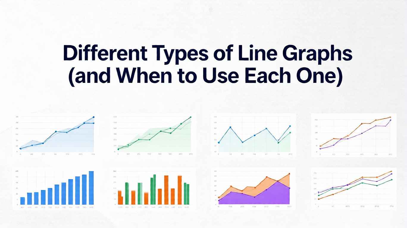
12 Types of Line Graphs: Examples & When to Use Each (2026)
Line graphs look deceptively simple: an X-axis, a Y-axis, and a line connecting data points. But that simplicity hides a powerful family of variations, each tuned for different stories you might want to tell with your data. Choose the wrong type and your audience squints, misreads trends, or misses the point entirely. Choose the right one and the pattern you care about becomes instantly obvious.
In this guide, we will walk through the most useful types of line graphs, what they are good at, where they mislead, and how to choose between them. Whether you are working in spreadsheets, BI tools, or code, understanding these patterns will help you design clearer, more honest visualizations. If you want to try them hands-on, you can build any of these in our free line graph maker—just paste your data and switch between styles.
1. Simple Line Graph: The Baseline Workhorse
The simple line graph is the form most people imagine: a single series plotted over a continuous scale such as time, distance, or index.
- What it shows: How one metric changes over a continuous variable (often time).
- Typical examples: Daily active users, monthly revenue, hourly temperature.
When to use it
- You care about overall trend: up, down, cyclical, or stable.
- You do not need to compare many categories at once.
- Your audience is broad and you want the most interpretable choice.
For introductory explanations and textbook-style examples, resources like the line graph overview on Math is Fun illustrate clean, minimal designs that work well for teaching and reporting.
Pitfalls
- It can be tempting to add annotations, colors, and secondary axes until the plot becomes busy.
- If your data are highly irregular or extremely noisy, a simple line may look like jitter rather than signal—consider smoothing or aggregating.
2. Multiple Line Graph: Comparing Several Series
A multiple line graph plots two or more series on the same axes so you can compare them directly.
- What it shows: How several metrics evolve along the same scale.
- Typical examples: Sales by region, traffic by channel, performance of multiple models over time.
When to use it
- You want to answer questions like:
- “Which segment is growing faster?”
- “Do these categories move together or diverge?”
- You have fewer than about 4–5 lines to keep visual clutter manageable.
Guides like the Data Visualization Catalogue’s entry on line charts emphasize that position and slope comparisons are powerful, but only up to a point. Beyond a handful of lines, overlapping and color confusion make interpretation difficult.
Pitfalls
- Too many lines in one chart quickly cause overplotting: lines overlap and obscure each other.
- If categories are not clearly labeled (e.g., via direct labeling at line ends), viewers can lose track of which line is which.
Practical tip: When you have many categories, consider small multiples (Section 7) instead of cramming them into one panel.
3. Step Line Graph: Tracking Discrete Jumps
A step line graph connects points with horizontal and vertical segments, creating a staircase shape rather than straight diagonals.
- What it shows: Values that change at distinct moments and remain constant in between.
- Typical examples: Pricing tiers over time, system capacity changes, cumulative counts updated once per period.
When to use it
- The underlying process really does change in steps, not continuously.
- You want to emphasize exact change points, such as policy updates or configuration changes.
- You are visualizing count data that update in discrete increments (e.g., number of active subscriptions).
Step charts are often recommended in visualization best-practice articles (including many resources cited in dashboard design guidelines) for scenarios where straight lines would falsely imply smooth gradual change.
Pitfalls
- If the underlying phenomenon actually changes continuously (e.g., temperature), step lines can exaggerate abruptness.
- Overuse in contexts that do not have natural steps can make the chart look “blocky” and harder to read.
4. Smoothed or Curved Line Graph: Emphasizing Overall Shape
In a smoothed line graph, lines are drawn with curves (e.g., splines) rather than sharp angles. Sometimes the data themselves are smoothed statistically (e.g., moving averages or LOESS curves).
- What it shows: The general pattern or trend while softening noise.
- Typical examples: Long-term user growth, macroeconomic indicators, smoothed performance metrics.
When to use it
- Your data are noisy, but you want to highlight the overall tendency.
- You are presenting to non-technical stakeholders who care more about direction than individual spikes.
- You explicitly communicate that the curve is a model or summary, not the raw data.
For exploratory analysis, many statisticians and data scientists use smoothed curves (e.g., LOESS) to reveal structure in noisy time series; introductions can be found in statistical visualization texts and in documentation of tools like ggplot2 and seaborn. For a practical walkthrough of this pattern, see our smoothed line chart guide.
Pitfalls
- Over-smoothing can hide important anomalies or sudden changes that matter operationally.
- Curved interpolation between sparse points can suggest false intermediate values, especially with non-time X-axes.
- If you do not label the curve as a “7-day moving average” or “smoothed trend,” viewers may assume it reflects exact data.
Rule of thumb: Always keep a way to inspect the raw series—either as a lighter line in the background, points on top of the curve, or an alternate view.
5. Area Line Graph (Area Chart): Emphasizing Volume
An area line graph fills the space under the line with color, turning the line into a shape. Area charts can be simple (one series) or stacked (multiple series whose filled regions accumulate).
- What it shows: Magnitude over time, with a strong sense of “volume” or accumulation.
- Typical examples: Total page views, energy consumption, financial balances, portfolio value.
When to use it
- You want to emphasize the size of something over time, not just the direction of change.
- Stacked area charts: you care about both the total and the composition of the total (e.g., traffic by channel where the top boundary shows the total).
For a broader comparison of when to choose area vs. line charts, references such as the Data Visualization Catalogue and vendor documentation (Power BI, Tableau, etc.) show that area charts work well when totals and parts-of-a-whole are central to the story. To build one yourself, try our free area chart maker, which supports both simple and stacked layouts.
Pitfalls
- Area charts make precise comparisons between series harder, especially in stacked form where only the bottom series has a stable baseline.
- If your audience needs to compare fine-grained differences between categories, regular multiple line graphs or small multiples are often clearer.
6. Band or Ribbon Line Graph: Showing Uncertainty and Ranges
A band line graph (also called a ribbon chart) combines a central line with a shaded band that indicates a range—such as forecast intervals, minimum/maximum values, or variability.
- What it shows: A typical value plus the range of plausible or observed values around it.
- Typical examples: Forecasts with confidence intervals, temperature ranges (high/low), performance envelopes.
When to use it
- You need to communicate uncertainty honestly—forecasts, model predictions, or noisy measurements.
- You want to prevent users from treating a line as a precise prophecy rather than a probabilistic estimate.
The importance of visually encoding uncertainty is frequently emphasized in visualization research communities (e.g., papers and talks from venues like IEEE VIS), which show that shaded bands often outperform error bars in perceived clarity for time series. See our confidence band line chart guide for a hands-on example.
Pitfalls
- If the band is too light, users may ignore it and read only the line.
- If it is too dark, it can dominate the chart and obscure the central trend.
- Ranges without clear labels (e.g., “90% confidence interval”) can confuse rather than clarify.
7. Small Multiple Line Graphs: Many Lines, Many Panels
Small multiples show multiple similar line graphs in a grid, all sharing the same scales and structure. Instead of one chart with many overlapping lines, you get many small charts, each typically with one or two lines.
- What it shows: Comparisons across many categories or segments without visual clutter.
- Typical examples: Revenue by country, metrics by product, sensor readings by device.
When to use it
- You have many categories (e.g., 10–50) that would be unreadable in a single multiple-line chart.
- You want to compare shapes of trends (e.g., which products are seasonal vs. steadily growing).
- Screen real estate allows for a grid or scrolling.
Small multiples stem from classic principles articulated by experts like Edward Tufte, who argued that aligned, repeated panels allow powerful comparisons with minimal cognitive load.
Pitfalls
- If axes are not consistent across panels, users can easily misinterpret magnitudes.
- Too many panels without grouping or ordering can be overwhelming; sort or cluster them meaningfully (e.g., by total value or growth rate).
8. Sparklines: Tiny Lines for High-Density Summaries
Sparklines are miniature line graphs embedded in text, tables, or dashboards. They usually lack axes and labels, focusing purely on shape and direction.
- What it shows: A compact visual summary of change over time.
- Typical examples: Stock tables, KPI lists, inboxes showing activity trends.
When to use it
- You need to show many time-series trends in a highly space-constrained layout.
- The audience already understands the general context (e.g., “higher is better”), and you only need a quick “up/down/volatile” signal.
Sparklines are widely discussed in data visualization literature as “data-intense, design-simple” graphics that let readers scan patterns at a glance without leaving the flow of text or tables.
Pitfalls
- Without axes or labels, sparklines are not suitable for precise reading or analytical decisions.
- They should complement, not replace, larger charts where exact values and time points matter.
9. Polar and Radial Line Graphs: Cycles and Directions
In polar or radial line graphs, data are plotted around a circle rather than along a straight horizontal axis. Time or angle wraps around, making cycles explicit.
- What it shows: Periodic patterns and directionality.
- Typical examples: Daily or seasonal cycles, wind direction and speed, cyclical workflows.
When to use it
- You care specifically about cycles (e.g., comparing patterns over a 24-hour day or a year).
- The circular representation helps emphasize that the end connects back to the beginning.
For certain meteorological or directional data, polar charts can reveal symmetry or recurring patterns that linear charts obscure, as seen in many applied visualization case studies.
Pitfalls
- Radial layouts are harder to read accurately than Cartesian ones; distances and angles are less intuitive than vertical position.
- Avoid using polar line graphs when a standard line chart would work just as well; otherwise you risk adding novelty without insight.
How to Choose the Right Type of Line Graph
With so many options, it helps to anchor your choice in a few key questions:
- What is the core question?
- Trend over time for one metric → simple line.
- Comparison between a few categories → multiple line.
- Many categories at once → small multiples or sparklines.
- Is the process continuous or stepwise?
- Stepwise changes (pricing tiers, policy changes) → step line.
- Continuous changes (temperature, speed) → standard line or smoothed trend.
- Do you need to show uncertainty or composition?
- Uncertainty or forecast ranges → band/ribbon line.
- Composition of a total → stacked area line graph.
- What level of precision does the audience need?
- Strategic, high-level view → smoothed trends, area charts, sparklines.
- Operational, precise view → simple or multiple line graphs with clear axes and labels.
When in doubt, start with the simplest possible line chart that answers your question. Only introduce more complex variants when they clearly reduce ambiguity or reveal structure that would otherwise be hidden. Curated resources such as the Data Visualization Catalogue or vendor-specific visual galleries provide side-by-side examples that can guide these decisions. And when your data is about correlation rather than trends over time, switch to the scatter plot maker instead.
FAQ
Q1: What is the most commonly used type of line graph? The most common form is the simple line graph: a single metric plotted over time. It is popular because it is easy to read and works well for dashboards, reports, and presentations. Many more advanced types—such as bands, areas, and small multiples—can be seen as extensions or combinations of this basic form.
Q2: When should I avoid using line graphs altogether? Avoid line graphs when your X-axis does not represent a continuous variable or an ordered sequence (for example, unordered categories like product names). In those cases, bar charts or dot plots are usually clearer. Our free bar chart maker is built for exactly those categorical cases. Also be cautious when you have very sparse data points; connecting them with lines can imply continuity that does not exist.
Q3: How many lines are too many in a single chart? Once you exceed about four or five series, most viewers begin to struggle with color and pattern discrimination, especially on small screens. If you need to compare more categories, small multiple line charts or interactive filtering are usually better options than stacking everything into a single dense plot.
Q4: Should I always smooth noisy time-series data? No. Smoothing is a modeling choice, not just a cosmetic one. It is helpful when you want to emphasize long-term tendencies and downplay random fluctuations, but it can hide meaningful anomalies or sudden changes. A good compromise is to show both: the raw line (in a lighter style) and a smoothed trend (in a bolder style), clearly labeled.
Q5: How do line graphs fit into modern dashboards and AI analytics? Line graphs remain central to dashboards and AI-driven analytics because so many business metrics are time-based. Modern tools layer additional intelligence on top of these lines—automatic anomaly detection, narrative summaries, and forecasts—turning static charts into active signals. Understanding the underlying types of line graphs helps you choose the right visual foundation before you add these advanced capabilities.
Share this article
Help others discover this content
Published on November 24, 2025
Last updated on May 29, 2026